Mastering Colour Theory in Fashion to Elevate Your Brand
Learn how to use colour theory in fashion to create stunning collections, build a powerful brand identity, and increase sales with actionable strategies.
When Valentino rolled out its PP Pink collection, it wasn't just a bold creative move — it was a masterclass in market domination. That single hue generated an incredible amount of buzz, proving that colour is one of the most powerful tools in a fashion brand's arsenal.
Mastering colour theory in fashion is how you turn that tool into real, measurable profit. It moves colour from an abstract idea to a strategic lever that shapes brand perception and drives purchasing decisions.
According to a study cited by Secret De Peau, up to 90% of snap judgments about products can be based on colour alone. Platforms like Picjam now allow brands to test and refine these colour strategies instantly, saving thousands on traditional photoshoots while optimizing for conversion.
This guide breaks down colour theory in fashion into actionable steps for creating collections and campaigns that connect with customers.
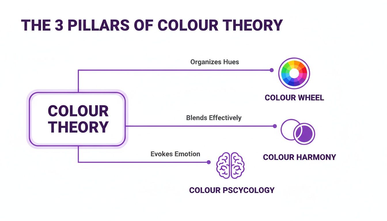
Here’s a quick look at what each pillar means for a fashion brand.
The 3 Pillars of Fashion Colour Theory
Understanding how these 3 pillars interact is the first step toward making colour a strategic asset rather than an afterthought.
How Colour Psychology Shapes Customer Perception
Colour is a silent conversation with your customer’s subconscious. The most legendary brands are built on this idea.
Take Tiffany & Co. They strategically owned a specific hue — Pantone 1837 Blue — that now signals luxury and exclusivity before you even see the brand name.
Similarly, Hermès turned its signature orange box into an icon of craftsmanship. These aren't happy accidents — they are masterclasses in how colour psychology creates tangible brand value.
The Emotional Spectrum of Colour
Different colours trigger specific emotional responses. Getting a handle on these associations is fundamental to mastering colour theory in fashion.
Red: Passion, excitement, and urgency. It’s a powerhouse for "Shop Now" buttons or limited-edition drops. Think of the flash of a Christian Louboutin sole — it’s an intentional statement of confidence.
Blue: Trust, stability, and calm. In fashion, denim is the ultimate proof of blue’s reliable, universally appealing power. Brands like Levi's have built empires on it.
Yellow: Optimism, youthfulness, and happiness. Brands targeting a younger audience, like Gen Z favourite Pacsun, often use vibrant yellows to create a feeling of energy and fun.
Green: Nature, health, and tranquility. It’s the go-to for sustainable brands like Patagonia or any wellness-focused activewear line wanting to signal their eco-conscious values.
Black: Power, sophistication, and elegance. From Chanel’s little black dress to a Saint Laurent leather jacket, black is the industry’s shorthand for timeless, high-end appeal.
Takeaway
Colour is a silent salesperson working 24/7. Here’s how to put it to work:
Audit your brand’s emotional tone. If you sell high-energy activewear but your site is mostly grey, you have a disconnect. Ensure your palette matches the feelings you want customers to associate with your products.
Use colour intentionally in your marketing. Test it. Try a vibrant, urgent colour like red or orange for a flash sale banner against a calming blue for a new collection announcement, then measure the difference in engagement.
Align product and campaign colours. A campaign for a soft, neutral loungewear line should feel serene and harmonious — not jarring and high-contrast.
How to Build a Signature Colour Palette
Your brand’s colour palette is its visual DNA. It answers the question: are you playful and electric like Ganni, or are you grounded and minimalist like Everlane?

The first step is translating your brand's personality into colour families. An edgy, urban streetwear brand will naturally land on a different palette than one selling soft, organic baby clothes. Once you have a direction, it's about creating balance.
Master Balance With the 60-30-10 Rule
An effective way to achieve balance is the 60-30-10 rule. It’s a classic from interior design that translates perfectly to fashion styling and collection planning.
- 60% Dominant Colour: This sets the overall mood. For a brand like Everlane, this is almost always a muted neutral like beige or grey.
- 30% Secondary Colour: This colour supports your dominant hue, adding depth without stealing the show.
- 10% Accent Colour: This is your pop of energy, used sparingly to catch the eye. For a minimalist brand, it might be a single bright accessory.
This simple ratio creates a visual hierarchy that feels professional and intentional. When you nail this, you can build brand awareness that truly connects with your audience.
Core vs. Seasonal Palettes
A smart colour strategy balances consistency with flexibility. Create two distinct palettes:
- Core Palette: These are your forever colours. They should appear in your branding, packaging, and signature products. Think of The Frankie Shop’s iconic neutrals.
- Seasonal Palette: These are the trend-driven colours that keep your brand feeling fresh. They work with your core palette but let you tap into new hues from forecasters like WGSN.
Takeaway
Your colour palette is your brand’s signature. Here’s how to build one that works:
- Define your brand’s personality first. Before picking shades, map your brand’s core attributes (e.g., bold, serene, classic) to colour families.
- Use the 60-30-10 rule for balance. Apply this ratio when planning collections and styling products to create visual harmony and a professional look.
- Test your palettes with AI. Instead of spending on physical samples, use tools like Picjam to generate visual concepts and A/B test different colour combinations directly with your audience to find out what converts.
How Colour Forecasting Saves Brands Millions
Modern colour forecasting began as a straightforward business problem: how to stop wasting money on clothes nobody wanted to buy. What started as swatch books in 1800s French textile mills to reduce errors has grown into a data-driven science that saves brands millions.

This early work laid the groundwork for industry giants like Pantone and WGSN.
These organizations turned forecasting into a major strategic force. Aligning with their predictions helps brands meet customer demand and avoid profit-killing markdowns. You can discover more about the journey of colour trend forecasting.
The Shift to AI-Powered Prediction
A study by McKinsey found that accurate trend forecasting can boost a fashion company’s profit margins by up to 5%. Today, AI models streamline this process by analyzing millions of data points, from social media trends to real-time sales data.
A brand like Zara uses AI to look at real-time sales data and social media buzz to pivot quickly. They can order more of a hot colour and dial back on a slow-mover, all based on live information.
This agility is what separates successful brands from the rest. AI tools make this power accessible to brands of any size, removing the need for expensive data science teams.
Takeaway
Colour forecasting is a powerful mix of human insight and machine intelligence.
Look beyond intuition. Back your creative decisions with data. Pay attention to reports from agencies like WGSN and Pantone to get ahead of the curve.
Embrace AI for agility. Use tools to analyze your own data. Identify your bestselling colours and what resonates on social media to inform your strategy.
Think efficiency. Forecasting is about reducing waste and maximizing profit. Align your seasonal palettes with validated trends to cut the risk of unsold inventory.
How to Apply Colour Theory to Boost E-commerce Sales
All the theory in the world is just noise until it generates clicks and sales. This is where colour theory in fashion becomes one of your sharpest tools for driving revenue.
On product detail pages (PDPs), neutral backgrounds — whites, soft greys, or warm beiges — let the product's true colour shine. This builds trust and reduces returns.
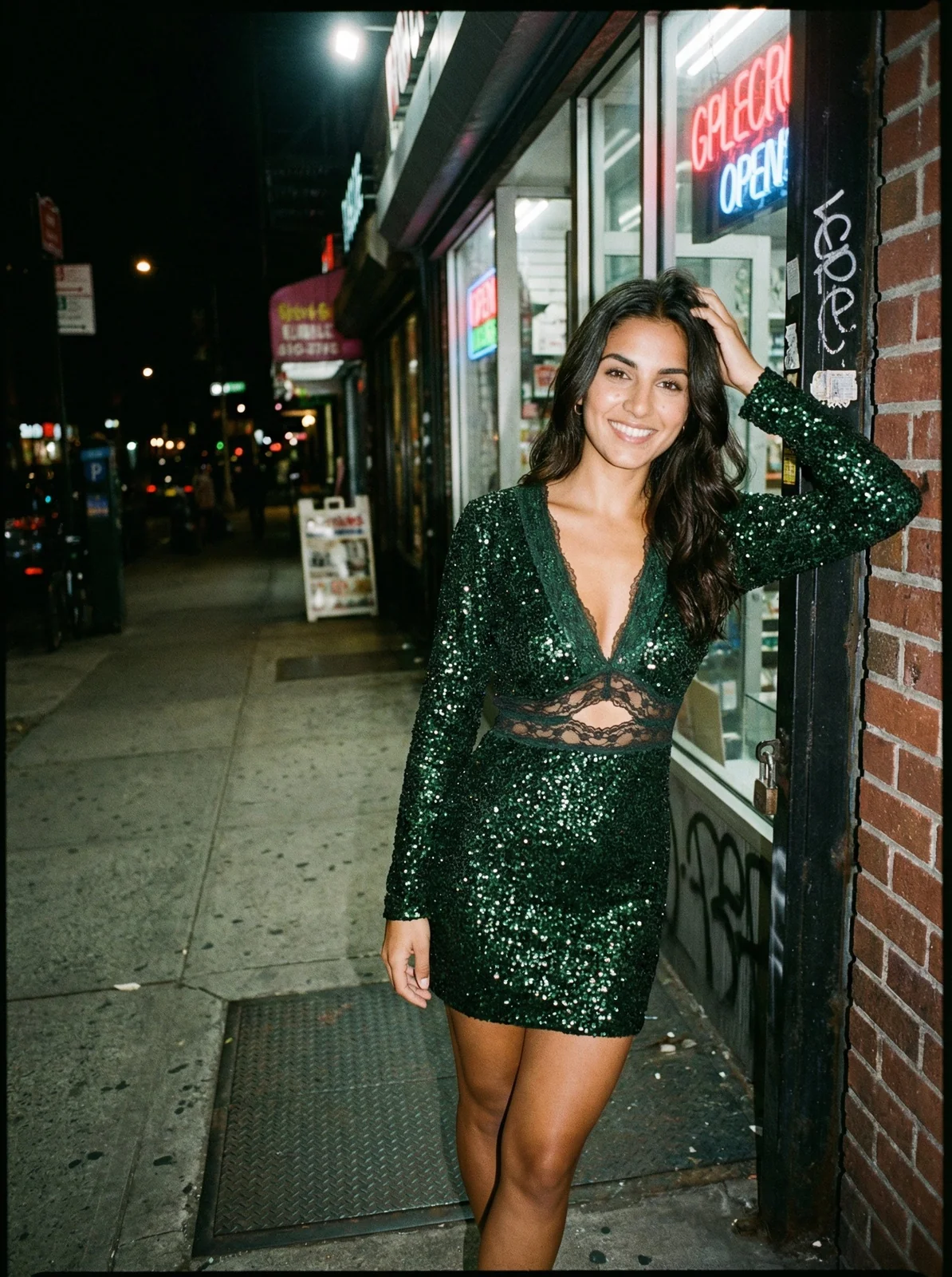
But shoppers also want to see products in context. This is where lifestyle images built on harmonious colour palettes make a difference.
Craft High-Converting Lifestyle Imagery
Lifestyle photos help customers visualize a product in their own lives. The background’s colour palette tells that story instantly.
Complementary Backgrounds: To make a product pop, set it against its complementary colour. A marigold yellow dress against a soft lavender wall creates a dynamic, eye-catching image perfect for social media ads.
Analogous Palettes: For a serene, cohesive vibe, an analogous palette is ideal. Picture a forest green coat shot against a backdrop of deeper greens and teals for a sophisticated, harmonious image.
Save 80% on Content Costs with AI
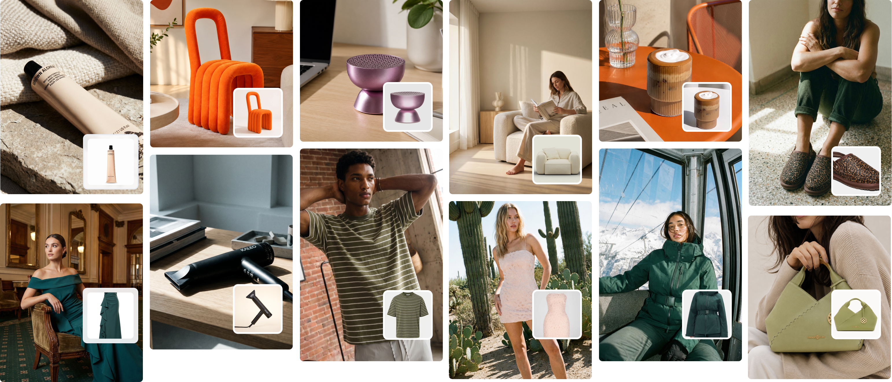
Testing these ideas used to be brutally expensive, requiring separate photoshoots for every variation. AI platforms like Picjam solve this problem.
Brands can upload a single product photo and instantly generate hundreds of on-model variations with different backgrounds. This allows you to A/B test a new sweater against a complementary autumn background versus an analogous spring cityscape to see which drives more clicks.
This approach not only saves up to 80% on production costs but also provides data-backed insights, which have been proven to lift marketplace rankings by 25% by creating on-trend visuals. For a deeper look, check our guide on how to improve e-commerce conversion rates. You can also read more about how color trends are analyzed.
"A customer’s decision to click 'Add to Cart' is often made in a split second, driven by emotion. The right colour harmony in your product image can be the silent persuader that closes the sale." — Zoe Maxwell, E-commerce Stylist
Takeaway
- Prioritize clarity on PDPs. Stick to neutral backgrounds for primary product shots to ensure colour accuracy and build customer trust.
- Tell a story with lifestyle images. Use harmonious colour palettes (complementary or analogous) in lifestyle shots to create an emotional connection.
- Test and optimize with AI. Use tools like Picjam to A/B test different colour schemes and backgrounds without the high cost of traditional photoshoots. Use that data to double down on what converts.
From Theory to Action: Your Next Steps

Understanding colour theory in fashion is about building a visual language that connects with your audience and drives sales.
By weaving the principles of the colour wheel, harmony, and psychology into your workflow, you create a brand that is not just seen, but felt.
Modern tools have collapsed the timelines and costs of testing these ideas. Imagine generating an entire season's campaign imagery in an afternoon or testing 5 colour harmonies without producing a single physical sample. This agility is the new standard.
Takeaway
Theory is only powerful when put into practice. Here are 3 actionable learnings you can try immediately.
Conduct a brand colour audit. Objectively review your website, social media, and product images. Does your palette align with your brand’s personality? Identify gaps and create a more cohesive visual identity.
Develop a new micro-palette. Build a seasonal palette of 3–5 colours using the colour wheel principles. Challenge yourself to build it around one of your core brand colours, using an analogous or complementary scheme.
A/B test with AI. Pick a bestseller. Use a tool like Picjam to generate two sets of lifestyle images with different background harmonies (e.g., one complementary, one analogous). Run these in a targeted ad campaign and measure the impact on conversions.
How do I pick colours that are inclusive and accessible?
To ensure your visuals work for everyone, including customers with colour blindness, focus on contrast.
The Web Content Accessibility Guidelines (WCAG) recommend a contrast ratio of at least 4.5:1 for normal text. Use free online contrast checkers to test your colour pairings for websites and marketing emails.
For product photos, show the item in different lighting and settings. This helps all customers get a true feel for the colour, which builds trust and cuts down on returns.
The Big Idea: Always go for high-contrast pairs for text and backgrounds. Never rely on colour alone to communicate critical info like sale prices — back it up with text or an icon.
What are the best free tools for creating a colour palette?
You don’t need expensive software to build an effective palette.
- Coolors.co: User-friendly — just hit the spacebar to generate harmonious palettes, or upload a photo to pull colours directly from it.
- Adobe Color: A more robust tool that lets you build palettes on the colour wheel using rules like complementary, analogous, and triadic.
- Canva Color Palette Generator: Simple and effective. Upload a photo, and it instantly generates a palette based on its most important hues.
These are perfect for brainstorming before committing to a full collection.
How often should a small brand update its seasonal colours?
For most small to medium-sized brands, a rhythm of 2 to 4 seasonal updates per year is ideal.
- Stick to your core palette: Your main brand colours should remain consistent.
- Add a seasonal micro-palette: Each season, bring in 2–3 accent colours that nod to current trends from sources like Pantone or WGSN.
- Test before you invest: Before ordering a huge run of inventory, use a tool like Picjam to create images of your bestsellers in the new seasonal colours. Test how they perform on social media for a fraction of the cost of physical samples.
This strategy keeps your brand current while maintaining a strong, recognizable identity, ensuring every decision is both creative and commercially smart.
Ready to put these ideas to work? Compare Picjam with your brand's current photography cost using our savings calculator.

Picjam team
The Picjam team blends AI, product, and creative expertise to eliminate the cost and delay of traditional photography for modern eCommerce brands.