How to Improve Ecommerce Conversion Rates in Fashion: A Practical Guide
Discover how to improve ecommerce conversion rates with fashion-focused tactics to optimize product pages, checkout, and UX, drive higher sales today.
When luxury brand Burberry tested AI-generated backgrounds for its product pages, it saw a significant lift in engagement by matching visuals to specific markets — without costly reshoots. This is how modern brands are learning how to improve ecommerce conversion rates: not with generic advice, but with targeted, data-driven visual strategies. The pillars are clear — visual storytelling, product page clarity, and a seamless mobile experience.
How AI Helps Brands Break the 2% Conversion Rate Ceiling

If your fashion brand’s conversion rate is hovering under 2%, you’re not just average; you're leaving significant revenue behind. According to a 2025 industry report, the typical fashion ecommerce conversion rate lands between 1.6% and 1.9%. This razor-thin margin means small, strategic improvements deliver major wins.
The problem isn't your collection. It’s the digital experience failing to build trust and answer shopper questions instantly.
Diagnosing the Most Common Conversion Killers
Most brands struggle with the same core issues. Before you can improve your ecommerce conversion rate, you must identify what’s holding you back.
The usual suspects include:
- Weak Product Imagery: Your photos must answer questions about texture, fit, and movement. A single, flat shot on a white background doesn't show a customer how a dress drapes or a jacket feels.
- A Disjointed Mobile Experience: With over 70% of traffic from mobile, a clunky site is a direct invitation for cart abandonment.
- Generic Product Descriptions: Copy listing only features is a missed opportunity. You need to sell the benefit and how the garment will make your customer feel.
- Hidden Costs & Clunky Checkout: Surprise shipping fees and a long checkout process are the top two reasons shoppers abandon carts, according to Baymard Institute.
"A customer should be able to look at a product photo and instantly imagine themselves wearing it," notes a former creative director for a high-street brand. "If they can’t, you've already lost half the battle."
The Savings Advantage of AI in Visual Merchandising
So, how do you fix this at scale? Forward-thinking brands are turning to AI to create more compelling visuals without inflating their budgets.
Tools like Picjam can take a single product photo and generate hundreds of on-model and lifestyle variations.
This lets you A/B test five completely different hero images for a new dress without booking a model or studio. You can discover what connects with your audience — which model, which setting, which vibe — and slash content production costs in the process.
Elevate Product Visuals to Drive Purchase Decisions

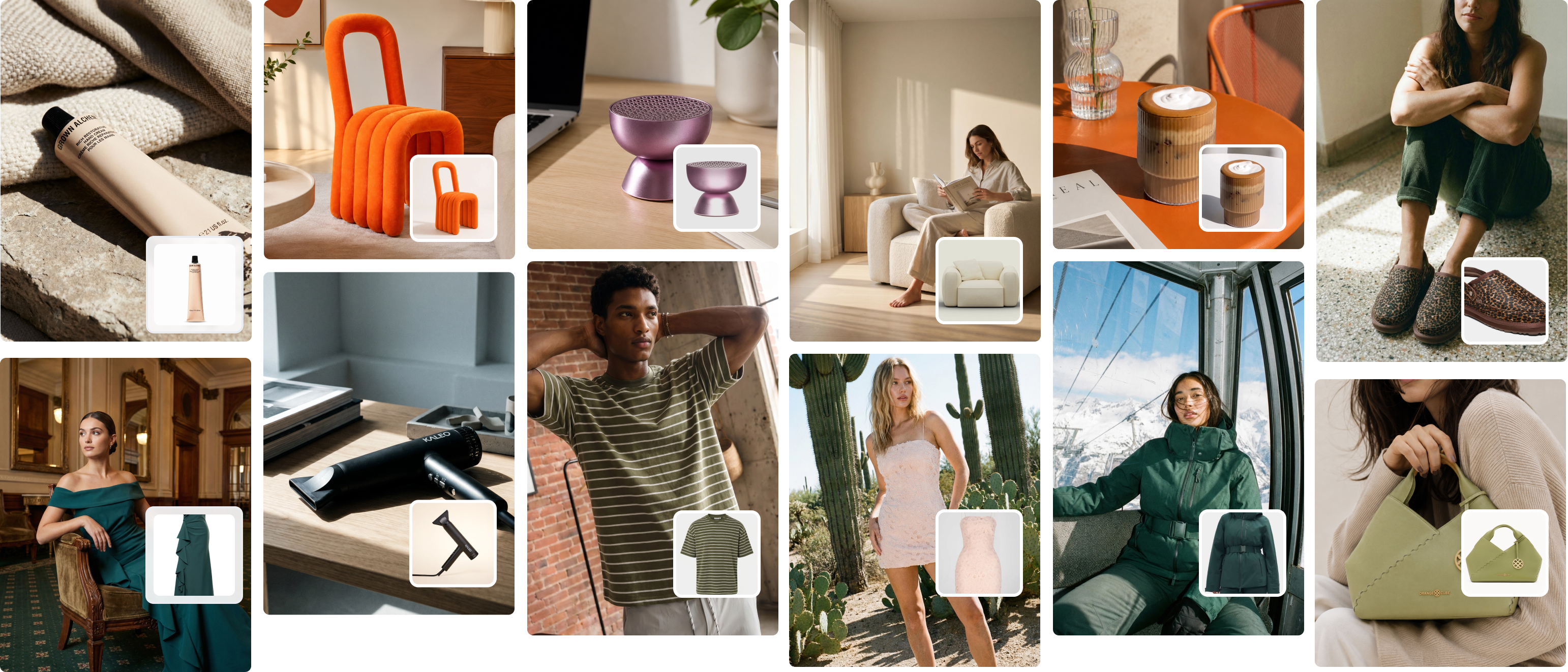
In fashion, the image sells the garment. Shoppers can’t touch the fabric or feel the fit, so your photography must do all the heavy lifting. A high-converting product page is a curated gallery, not just a catalog listing.
Think about a brand like Reformation. They show a dress in a clean studio shot and in a sun-drenched, real-world context. One photo shows the precise cut and color; the other shows how the fabric moves when you’re walking to brunch. It connects the product to the customer’s life.
Build a Visual Gallery That Answers Every Question
A single, static image is no longer enough. To build trust and earn that add-to-cart click, your product detail page (PDP) needs a strategic mix of visual assets.
Here’s the breakdown:
- Clean Studio Shots: These are non-negotiable. A crisp, well-lit image on a neutral background highlights the product's true color and key details.
- On-Model Context: Show the garment on a person — ideally on diverse body types. This helps shoppers visualize fit and scale.
- Detail and Fabric Close-Ups: Let them inspect the craftsmanship. A macro shot of the fabric's weave or a unique button signals quality and justifies your price.
- Lifestyle and In-Context Images: This is where you sell the dream. A linen blazer in a studio is professional; on a model walking through a European street, it's aspirational.
Research from McKinsey suggests that brands leveraging rich, detailed imagery see a significant uptick in conversion. These visuals aren't just decorative; they're a core part of the decision-making process.
How AI Unlocks Rapid Visual Testing and Massive Savings
Creating this ideal photo mix traditionally costs a fortune in photoshoots, models, and locations. This is where AI-powered tools are transforming the process for modern fashion brands.
Platforms like Picjam allow you to take one studio shot of a garment and generate an endless array of high-quality variations in minutes. Imagine uploading a photo of a new blouse and instantly creating images of it on 10 different models in 5 distinct lifestyle settings.
This elevates your visual strategy from a slow, expensive process to a rapid, data-driven one.
Instead of guessing which hero image will perform best, you can generate a dozen options and A/B test them. The efficiency translates directly to massive savings. By reducing physical photoshoots, brands can cut content production costs significantly. For more on this, check out our guide to AI product photography.
Takeaway
Your visual strategy is a direct lever for your conversion rate. The goal is to create a complete visual narrative that answers every potential customer question.
- Audit Your Visuals: Review your top 5 product pages. Do they have the full mix of studio, on-model, detail, and lifestyle shots? Identify the gaps.
- Test and Iterate with AI: Use a tool like Picjam to generate different hero images for one product. Run a simple A/B test to see which visual style drives the most add-to-carts.
Craft Product Pages That Turn Clicks Into Sales

Your product page is your final pitch before checkout. This is where compelling storytelling meets a frictionless user experience. It's the moment you persuade a shopper that your product is the one.
A page that converts doesn't just list features. It sells benefits and builds unwavering confidence.
Look at a brand like Allbirds. They don’t just say their shoes are made of wool. They talk about the feeling of that material — the breathability, the softness, the sustainability. This shift from what it is to what it does for you is how you connect emotionally.
Translate Features into Benefit-Driven Copy
Shoppers arrive on your product page with a mental checklist. Your copy's job is to answer every single one of their questions.
Writing copy that converts is about preemptive problem-solving. It must be clear, concise, and easy to scan.
Start by translating every feature into a direct customer benefit:
- Feature: “Made from 100% silk.”
- Benefit: “Lightweight and breathable, keeping you cool and comfortable all day.”
Use scannable bullet points for must-know details like fit, fabric care, and dimensions. This lets shoppers absorb key information fast.
According to Nielsen Norman Group, users only read about 20% of the text on an average web page. This makes scannable formats like bullet points and bolded text essential for getting critical info across quickly.
Build Trust with Social Proof and Total Transparency
Nothing builds confidence faster than seeing other people love your product. Integrating user-generated content (UGC) directly onto your product pages is a powerful form of social proof.
A brand like Princess Polly nails this. They showcase customer photos that provide real-world context for fit and styling, which is far more convincing than a perfectly styled studio shot.
Beyond UGC, transparency is non-negotiable.
Here are a few essentials you can't skip:
- Clear Sizing Guides: Don’t just use a generic chart. Show the model’s height and the size they're wearing to give shoppers a real-world reference point.
- Upfront Shipping and Return Details: A study by the Baymard Institute found that 48% of shoppers abandon carts because of unexpected extra costs. Put your policies where people can see them.
- Smart Cross-Selling: Suggest complementary items that complete a look. This improves the user experience by acting as a personal stylist.
Takeaway
Your product page is your digital salesperson. Equip it to close the deal by building trust and eliminating friction.
- Rewrite Your Copy: Review your top 3 product descriptions. Turn those feature lists into benefit-driven bullet points that solve your customer's problems.
- Integrate Social Proof: Feature customer photos or reviews directly below your main product images. Let your happy customers do the selling for you.
- Audit for Transparency: Make sure your sizing, shipping, and return info is impossible to miss. Clarity kills the hesitation that kills conversions.
Streamline Your Checkout to Eliminate Cart Abandonment
You’ve done the hard work. The visuals are compelling, the PDPs are convincing, and the shopper hit “Add to Cart.” But for too many brands, this is where the sale dies.
Your checkout process is almost certainly the leakiest part of your funnel.
The average cart abandonment rate is a staggering 70.19%. That’s a massive amount of lost revenue, usually caused by fixable friction points. If you want to lift your conversion rate, you must make your checkout ruthlessly efficient.
Simplify to a Single, Seamless Experience
Modern shoppers have zero patience for multi-page forms or forced account creation. Every extra click is another chance for them to leave. Your goal is to remove every obstacle between your customer and the “Complete Order” button.
Brands like Everlane built a following not just for their apparel, but for their famously clean and transparent checkout. Simplicity builds trust.
Here’s how to streamline your process:
- Offer Guest Checkout: Forcing account creation is a classic conversion killer. Always feature a prominent guest checkout option.
- Embrace a Single-Page Design: Consolidate shipping, billing, and payment onto one clean page. It makes the process feel less like a chore.
- Integrate Express Payment Options: Add one-click methods like Apple Pay, Google Pay, and PayPal. They autofill customer info, turning a multi-step process into a single tap.
Build Unshakeable Trust at the Final Step
When a customer pulls out their credit card, their need for security goes into overdrive. This is your last chance to reassure them.
A Baymard Institute study found that 19% of shoppers abandon carts because they don’t trust the site with their credit card information. Visual trust signals are critical.
Displaying security cues isn't optional.
- Show Security Badges: Display SSL certificates and seals like Norton or McAfee prominently near payment fields.
- Display Payment Logos: Feature logos for every card and payment method you accept (Visa, Mastercard, Amex, etc.). It’s an instant confirmation of legitimacy.
- Be Radically Transparent with Costs: Surprise fees are the #1 reason for cart abandonment. Show every cost upfront — shipping, taxes, everything — before the final payment step. No surprises. Ever.
For more on plugging these leaks, explore these proven strategies to effectively reduce cart abandonment.
Takeaway
Your checkout is the final handshake. Make it fast, transparent, and trustworthy to reclaim lost revenue.
- Audit Your Checkout Flow: Go through your own checkout as a new customer. Time it. How many clicks? Where did you hesitate? Find at least one step you can eliminate this week.
- Add Trust Signals: Make sure your security badges and payment logos are impossible to miss on your checkout page.
- Test an Exit-Intent Offer: Implement a popup when a user moves to exit the checkout page. An offer like 10% off or free shipping can be the nudge they need to finish.
Close the Mobile Conversion Gap for Good
Pull up your analytics. Mobile traffic is likely crushing it, but desktop is still where most sales happen. This isn't a rounding error; it’s a huge revenue gap that should be a top priority if you want to learn how to improve ecommerce conversion rates.
Mobile devices drive 73% of all online traffic, yet desktop conversion rates are around 4.8% compared to just 2.9% on mobile, according to this eCommerce performance overview. This disconnect between where customers find you and where they buy is a massive opportunity.
Closing this gap demands a true mobile-first obsession, where every element is built for a six-inch screen and a user who is likely multitasking.
Engineer Your Site for Thumbs and Speed
A great mobile experience boils down to two things: speed and simplicity. Your mobile shopper is distracted and has zero patience for slow-loading pages.
Look at ASOS. They practically wrote the playbook on mobile-first fashion. Their app and mobile site aren’t just usable — they’re a joy to use. Everything is lightning-fast, navigation is intuitive, and checkout is smooth.
To get there, you must be relentless about:
- Lightning-Fast Load Speeds: A one-second delay in load time can kill your mobile conversion rate. Compress every image and minify your code.
- Thumb-Friendly Navigation: Buttons must be big and tappable. Leave generous space around clickable elements to avoid frustrating mis-taps.
- A Persistent Cart: A customer’s cart must follow them across devices. If they add items on their phone, that cart better be waiting for them on their laptop.
Optimize Visuals and Payments for the Small Screen
On mobile, your visuals need to pop, even at a small scale. They have to be clear, compelling, and load instantly. This is where AI-driven creative tools offer a serious edge.
Instead of booking a new photoshoot, a tool like Picjam can generate visuals built specifically for mobile. Imagine taking one product shot and creating a set of vertical, 9:16 on-model images perfect for an Instagram Stories ad.
This creates a fluid journey from discovery to purchase. A user taps a story, lands on a mobile-optimized PDP, and glides into a streamlined checkout. Visual consistency builds trust.
"Asking a mobile user to manually enter a 16-digit credit card number is one of the fastest ways to lose a sale," says a leading eCommerce consultant. "The goal is to make buying easier than abandoning the cart."
One-click payment options are no longer a "nice-to-have." Integrating wallets like Apple Pay, Google Pay, and Shop Pay eliminates the biggest obstacle in the mobile checkout flow.
Takeaway
Your mobile site is your primary channel. Treating it like anything less is leaving money on the table.
- Audit Your Mobile Speed: Use Google PageSpeed Insights to test your top landing pages. Find the anchors slowing you down — it's almost always oversized images — and fix them.
- Implement Express Checkout: If you haven’t integrated Apple Pay and Google Pay yet, make it your top priority this quarter. It's one of the highest-impact changes you can make.
So, What Should You Do Next?
Real growth comes from doing. The secret to boosting your ecommerce conversion rate is found by testing, learning, and iterating. Fast.
Here’s a breakdown of what you can tackle today to start seeing a real difference.
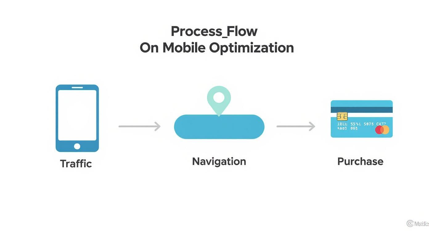
This diagram is a simple reminder of the mobile shopper’s journey. Every step is a potential exit point. Small tweaks can have a massive impact on your final numbers.
Your Immediate Hit List
Focus on these three high-impact tasks this week:
Audit Your Top 5 Product Pages
Pull up your best-sellers. Are you showing the clothes in motion? On diverse models? In a real-world setting? Pinpoint the visual gaps that stop customers from picturing themselves wearing your product. For best practices, see our guide on e-commerce product photography services.Tackle Your Checkout Funnel
Dig into your analytics and find the exact spot where most people drop off during checkout. Is it the shipping cost reveal? Is it the "create an account" page? Design one simple A/B test to fix that single friction point.Experiment with AI Creatives
Traditional photoshoots are slow and expensive. AI image generation tools let you create and test a flood of new visuals without the huge cost and time commitment, helping you find what converts faster.
To go deeper, explore 10 powerful conversion rate optimization techniques that turn browsers into buyers.
Takeaway
Real growth comes from taking targeted, data-backed action. Don't try to fix everything at once.
- Prioritize Visuals: Your images are your most powerful sales tool. Start by upgrading the photography on your single best-selling product page. Use AI to test multiple lifestyle and on-model shots to find a clear winner.
- Eliminate One Checkout Step: Go through your own checkout process and identify the single most annoying or time-consuming step. Make a plan to eliminate or simplify it this week. This could be as simple as defaulting "billing address is same as shipping."
Ready to see how much you could save on creating high-converting visuals? Compare your current photography costs with Picjam's AI studio using our savings calculator.

Picjam team
The Picjam team blends AI, product, and creative expertise to eliminate the cost and delay of traditional photography for modern eCommerce brands.