Photography Lighting Basics to Elevate Your Product Shots
Master photography lighting basics to create ecommerce images that convert. Learn to use light to define texture, ensure color accuracy, and boost sales.
By Michael Pirone, Founder of Picjam & Vidico
You can have the best camera, the sharpest lens, and the most beautiful garment, but if your lighting is off, none of it matters.
Light is the single most powerful tool you have. It’s what separates a product that looks flat and cheap from one that customers can practically feel through the screen.
Think of it this way: lighting is your brand’s visual storyteller. It's the silent communicator that tells a customer everything they need to know about your apparel's quality, color, and feel.
How Light Shapes What Your Customers See
Good lighting does more than just make a product visible; it defines it. The right light can make a simple cotton t-shirt look crisp and premium. The wrong light can make a thousand-dollar silk dress look like a bargain-bin find.
This is the real power of lighting in e-commerce. It controls whether the rugged texture of a denim jacket stands out, whether the colors of a vibrant print are true to life, and whether the silhouette of a blazer looks sharp and tailored. It’s about creating desire and trust before a customer ever touches the fabric.

When you understand how to use light, you can guide a shopper’s eye exactly where you want it to go. This is a lot like mastering visual hierarchy in graphic design. You can use light and shadow to spotlight the intricate weave of a sweater, the smooth finish of leather, or the delicate drape of a scarf.
Defining Key Lighting Qualities
You don't need to be a seasoned director of photography to get this right. For fashion brands, a solid grasp of a few core lighting principles is all it takes to make a huge impact. It's less about technical jargon and more about knowing how to create a specific mood that fits your brand.
This is where platforms like Picjam have changed the game. You can essentially test-drive professional lighting setups on your products virtually. It allows you to experiment with different styles and see what works for your brand, all without booking a single minute of studio time.
To get you started, let's break down the fundamental qualities of light. Understanding these 4 concepts will give you the vocabulary to either create the look you want or ask a photographer for it.
The table below breaks down the fundamental characteristics of light and how they directly impact the way your apparel shows up in photos.
Key Lighting Qualities at a Glance
| Quality | Description | Best For |
|---|---|---|
| Hard Light | Creates sharp, well-defined shadows and high contrast. | Emphasizing texture (denim, leather) and creating drama. |
| Soft Light | Creates gentle, diffused shadows and low contrast. | Flattering delicate fabrics (silk, cashmere) and clean looks. |
| Warm Light | Has a yellowish or golden hue, like sunset. | Creating a cozy, nostalgic, or vintage brand feeling. |
| Cool Light | Has a bluish hue, like an overcast day. | Conveying a modern, clean, and crisp aesthetic. |
These qualities aren't just technical terms; they're creative choices. The light you choose will set the tone for your product before a customer even reads the description.
Hard Light vs. Soft Light: What Fashion Brands Must Know
Getting a handle on the difference between hard and soft light is one of the first things you learn in photography, but it’s an area where so many brands miss a huge opportunity. The quality of your light isn't just a technical detail; it sets the mood for the entire image and shapes how a customer feels about your product. Nailing this choice is the first step to creating photos that actually speak your brand's language.
Think of hard light as the intense, unfiltered sun at high noon. It’s a small, focused light source that throws sharp, well-defined shadows with crisp edges. This high-contrast look is your go-to for creating drama and making textures leap off the screen.
For fashion, hard light is a powerful tool for adding an edge. It’s perfect for making the grain of a leather jacket pop or highlighting the rugged weave of raw denim. A brand like AllSaints uses this style all the time to build a moody, confident vibe that perfectly matches its rock-and-roll identity.
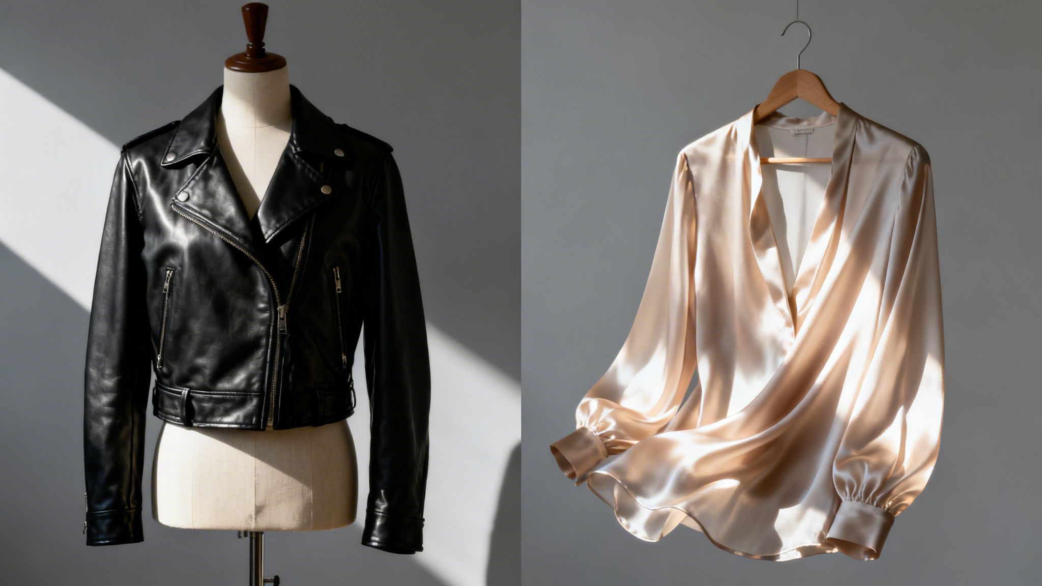
This image says it all. The hard light carves out deep, specific shadows, while the soft light wraps around the subject for a much gentler feel.
The Gentle Touch of Soft Light
On the flip side, soft light feels like a bright but overcast day. It comes from a large, diffused source, which lets the light wrap around your product. This softens the shadows and dials down the harsh contrast, creating a much more flattering and approachable feel.
This is the lighting you want for delicate materials like silk, chiffon, or cashmere. It ensures the garment’s shape is beautifully defined without any distracting shadows getting in the way. Brands like Reformation rely on soft light to create a clean, aspirational, and feminine look that feels both effortless and modern. The soft shadows complement the natural flow of their dresses and blouses.
Soft light is more forgiving and generally the safer bet for e-commerce. It reveals product details clearly without creating harsh shadows that can hide parts of the garment. For more on shadow control, check out our guide on how to get rid of shadows in pictures.
Ultimately, your choice boils down to the story your brand is telling. Are you edgy and bold, or are you soft and elegant? The light you choose is your first move in answering that question for your customers. Experimenting is key, and tools like Picjam let you test both hard and soft virtual lighting to find the perfect match for every single product — without the time and cost of a physical studio.
How Light's Color Temperature Affects Your Apparel
Ever ordered a navy blue dress online, only to have it show up looking jet black? Or maybe you bought a cream-colored sweater that looked stark white on the website. 9 times out of 10, the problem isn't the product — it's the color temperature of the light used in the photoshoot. Nailing this is a fundamental part of photography that has a direct line to your customer satisfaction and, yes, your return rate.
Color temperature has nothing to do with how hot a lightbulb feels. It's all about the color of the light itself, which we measure on the Kelvin (K) scale.
Think about the warm, golden glow of a candle or a sunset. That's warm light, which sits on the low end of the scale (around 2000-3000K). It creates a cozy, nostalgic, or even luxurious feeling, making it a great choice for heritage brands or collections with a vintage vibe.
On the other end, you have the crisp, blue-white light of an overcast day. That's cool light, found at the higher end of the scale (over 5000K). This light gives off a clean, modern, and sharp aesthetic that you’ll often see with tech-focused or minimalist fashion labels.
Finding the Sweet Spot with Neutral Light
For most e-commerce brands, the goal isn't to be overly warm or cool. The sweet spot is neutral light. This is the light that sits right in the middle of the spectrum, somewhere between 4000K and 5000K. It’s the closest you can get to showing a garment's true color. When a customer sees your product under neutral light, what they see is what they’ll get. That builds trust.
Getting color right isn't just a creative choice; it's a business decision. A study found that 22% of online returns happen because the product looks different in person than it did online, with color being a primary complaint.
Traditionally, photographers get this "true color" look by manually setting the camera's white balance to match the light source. If you're shooting in warm light, you tell the camera to add more blue to compensate, and vice-versa. It’s a process that takes a good eye and a few test shots to get right.
But a manual approach always leaves room for human error and inconsistencies, especially when you’re shooting different products across multiple days. This is where AI-powered tools come in. Platforms like Picjam can automatically correct for color casts during the image generation process. The result is perfect, true-to-life color in every photo, without any manual tweaking. It takes the guesswork out of the equation and delivers consistent, accurate apparel images every single time.
Classic Lighting Setups You Can Easily Replicate
Knowing the theory is one thing, but actually putting it to work is where the magic happens. To help you get from concept to a great-looking shot, here are 3 classic lighting "recipes." Think of them as blueprints you can follow for both physical photoshoots and virtual setups to create a specific, intentional mood for your apparel.
Each setup serves a different aesthetic and purpose, but they're all adaptable for your brand.
The Standard: Three-Point Lighting
If there’s one setup every brand should know, it’s three-point lighting. This is the gold standard in the industry for a reason — it creates polished, professional shots that look clean and dimensional. It uses 3 distinct lights to shape your product perfectly.
- Key Light: This is your main and brightest light. You'll place it at about a 45-degree angle to the product, creating the primary illumination and defining your initial shadows.
- Fill Light: A softer light placed on the opposite side of the key light. Its job is to "fill in" and soften the harsh shadows your key light just made, which helps reveal more detail in the garment.
- Backlight (or Rim Light): Positioned behind the product, this light is what separates it from the background. It adds depth and creates that subtle, high-quality outline that makes an image pop.
This setup is incredibly versatile and works for everything from crisp button-down shirts to structured blazers. It guarantees the product is clearly lit, showing off form and detail without any distracting drama. And you don't need a huge budget for it — a bright window can work as your key light, with a simple white foam board acting as a reflector to fill in the shadows.
The Dramatic Choice: Rembrandt Lighting
Named after the famous painter, Rembrandt lighting is all about creating mood and drama. It’s a high-contrast style that uses just 1 or 2 lights to craft a look defined by a signature triangle of light on the cheek opposite the main light source.
To get this look, you place a single key light higher up and more to the side of your subject than you would in a three-point setup. This carves out deep, intentional shadows and creates a focused, intense feel. It’s perfect for brands with an edgy, artistic, or heritage aesthetic. It also works exceptionally well for bringing out the texture in materials like leather, wool, or denim.
This diagram helps visualize how the color of your light — its temperature — can influence the mood of these setups.
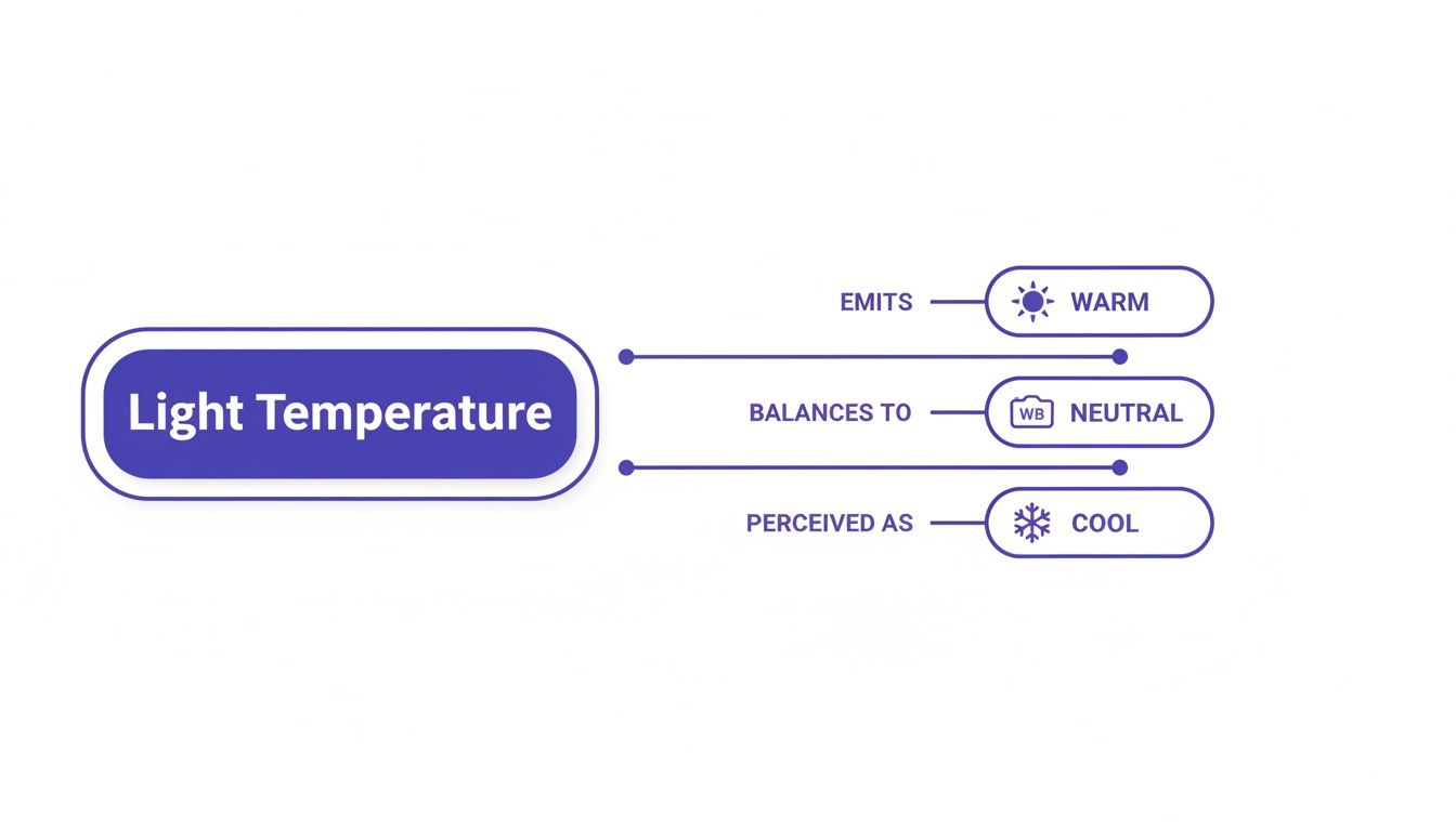
As you can see, warm light gives a golden, inviting hue. Neutral light gives you true-to-life color. And cool light creates a clean, almost blueish tone.
The E-commerce Essential: High-Key Lighting
When you need a bright, airy, and nearly shadowless look, high-key lighting is the answer. This setup floods the product with light, typically from the front, using 2 or more sources to wash out almost all shadows.
The goal here is an image that feels optimistic, clean, and modern — often shot against a pure white background. It has become a staple for direct-to-consumer websites where product clarity is king.
This setup is great for ensuring maximum detail visibility, making it a favorite for brands like Everlane who prioritize transparency and a minimal aesthetic.
How the Evolution of Lighting Unlocked Creative Freedom
It’s easy to take modern photography lighting for granted. To appreciate the creative freedom we have today, it helps to remember a time when photographers had only one light source to work with: the sun. This total dependence on unpredictable daylight turned every photoshoot into a waiting game.
Early photography wasn't just a craft; it was an exercise in patience defined by extreme limitations. When Joseph Nicéphore Niépce captured the world’s first photograph between 1826 and 1827, it required a staggering 8-hour exposure to direct sunlight just to produce a faint image. You can dig deeper into these historical hurdles and the evolution of photographic light.
From Sunlight to Science
The first real steps toward artificial light were game-changing. By 1839, L. Ibbetson was using limelight — an intense, white light created by heating quicklime — for microscopic photography. This new tool managed to cut exposure times by up to 70% compared to sunlight alone. It was a massive leap, proving for the first time that light could be controlled.
Later on, dangerously unstable flash powders and magnesium lighting shifted the balance of power even further. For the first time, photographers weren't completely at the mercy of the weather or time of day. But these methods were hazardous and almost impossible to control with any real precision — a far cry from the tools we have now.
Lighting as a Creative Choice, Not a Constraint
This journey really puts the power of today's tools into perspective. For over a century, the primary challenge in photography was simply getting enough light. Today, that’s no longer a technical barrier. It’s a purely creative one.
The contrast is especially stark when you look at modern AI platforms. Tools like Picjam can digitally replicate these historical breakthroughs, generating countless lighting variations in seconds without any physical gear. These platforms bypass the physical and financial hurdles that defined photography for generations, making professional-quality lighting accessible to any brand. It’s the ultimate evolution: turning light from a technical problem into a limitless creative asset.
Takeaway
All that theory is great, but how do you actually use it? Mastering the photography lighting basics is what turns simple product shots into images that actually sell. We’ve boiled it all down to 3 core actions you can take today.
1. Match Your Light to Your Fabric: Always serve the material. Use large, soft light for delicate fabrics like silk to create an elegant look. Use focused, hard light for textured materials like denim to highlight quality and add drama.
2. Prioritize Color Accuracy Above All: A product showing up in the wrong color kills trust. Always shoot in neutral daylight or set your camera’s white balance to match your light source. This ensures what customers see is what they get, which reduces returns.
3. Experiment Without the Expense: Finding the perfect lighting used to require expensive studio time. Today, you can use an AI-powered platform like Picjam to test out different lighting styles virtually — from soft and airy to dramatic and low-key — in seconds, saving enormous time and money.
Your Top Questions, Answered
Even after you’ve got the theory down, a few practical questions always pop up when you start applying these photography lighting basics to your own brand. Let's tackle the most common ones I hear so you have clear, ready-to-use answers.
What Is the Easiest Lighting Setup for a Beginner?
If you're just starting out, keep it simple. The most forgiving and effective setup involves one large, soft light source. Don't overcomplicate things.
This could be a big window on an overcast day for beautiful, natural light. Or, if you're using studio gear, one light aimed through a large softbox or umbrella will do the trick. Position this main light at a 45-degree angle to your product. This classic "one-light setup" is incredibly forgiving and a perfect starting point. It creates flattering, gentle shadows and delivers a clean, professional look without the headache of managing multiple lights.
How Does Lighting Affect Different Clothing Colors?
Lighting can dramatically change how colors show up in your photos, especially when you're dealing with very light or very dark garments.
Dark colors like black and navy just soak up light. This can swallow important details like seams, textures, or subtle patterns. To fix this, you’ll want to use a "fill" light or even just a simple white reflector to bounce light back into those shadowy areas and bring the details back to life.
Light colors, especially pure white, are the opposite — they reflect a ton of light and can easily get "blown out," which is when they become so bright you lose all the texture. For these items, using soft, diffused light and dialing back its intensity is absolutely crucial to keep that fabric detail from disappearing.
Can I Mix Natural and Artificial Light Sources?
Technically, yes, but I almost always advise against it for professional e-commerce shots. The big problem here is their competing color temperatures. Daylight is cool and has a blueish tint, while most indoor lighting is warm and yellowish.
When you mix them, you get competing color casts all over your product. It looks unprofessional and is a nightmare to try and fix accurately in post-production.
For consistent, high-quality images, pick one light source and stick with it. If you’re using window light, turn off all your indoor lamps. If you’re using studio strobes, pull the blinds and block any daylight from creeping in. This is the only way to guarantee your apparel's color stays true and consistent from one shot to the next.
Ready to see how much your brand could save by swapping complex shoots for powerful AI? Compare your current photography costs with Picjam’s AI-powered approach using our savings calculator and discover a smarter way to create high-converting content.

Picjam team
The Picjam team blends AI, product, and creative expertise to eliminate the cost and delay of traditional photography for modern eCommerce brands.
