AI Color Changer: A Guide for Apparel Brands
Learn to use an AI color changer for your apparel brand. Our guide covers asset prep, fabric realism, batch processing, and QA for perfect e-commerce images.
Michael Pirone, Founder of Picjam & Vidico
For apparel teams, the question is not whether an AI color changer can turn a red shirt blue. It can. The real question is whether the new blue still looks like the same garment, with the same knit texture, seam definition, trim detail, logo integrity, and natural shadow structure that a shopper expects on a product page.
That is the standard that matters in production. Practical guidance on AI color changer workflows shows the best results come from clean, well-lit images, clear object visibility, and precise HEX or RGB inputs. In apparel, that matters because folds, fabric behavior, and lighting response need to survive the edit. If they do not, the file may be fast to make, but it is not strong enough for a PDP, a marketplace listing, or a paid asset.
Why Apparel Brands Use AI Color Changes Instead of Reshooting Every Variant
Reshooting every colorway is expensive, repetitive, and often unnecessary.
If a brand launches one knit in six shades, the team can end up repeating the same setup, the same angles, and the same post-production work for images that are nearly identical apart from color. That is where a controlled AI color changer workflow can help. You build from one strong base image, create additional approved color variants, and reduce the amount of duplicate production work required to publish the full assortment.
The value is operational, not magical.
Where the savings actually come from
The savings show up across the workflow:
- Fewer repeat shoots: One approved hero image can support multiple color variants.
- Less production overlap: Creative, merchandising, and retouching spend less time revisiting the same SKU.
- Faster assortment coverage: Teams can populate PDPs, marketplaces, and campaign assets without waiting for every color to be shot separately.
- Clearer approvals: Defined color targets reduce subjective review cycles.
That is why good brands use recoloring as a production tool, not a novelty.
Practical rule: Use recoloring to remove repetitive variant work. Use a real shoot when the image depends on styling, motion, layered materials, or campaign-specific storytelling.
There are limits. AI color changes work best when the garment is clearly visible, well lit, and easy to isolate. They work less well when the product is blocked by hair, hands, props, outer layers, extreme reflections, or heavy motion.
For fashion teams building a practical content pipeline, tools such as Picjam and focused workflows like AI fashion photography fit this shift because they help brands reuse approved product assets instead of rebuilding the same work from scratch. The advantage is simple. You expand variant coverage, keep presentation consistent, and spend your production budget where shoppers will actually see a difference.
What an AI color changer is good at, and where to be careful
| Use case | Strong fit | Risk to watch |
|---|---|---|
| Basic product variants | Yes | Shade drift across angles |
| Apparel PDP imagery | Yes | Texture loss in knits, denim, silk |
| Paid social testing | Yes | Over-edited fabric can reduce trust |
| Complex editorial looks | Sometimes | Layered materials, trims, and lighting can break realism |
The teams that get the most from this workflow are not removing judgment. They are applying automation where repetition adds cost, then using human review where product truth and brand accuracy matter.
Preparing Your Assets for Flawless Recoloring
Teams often blame the tool when a recolor looks fake. In practice, the source file is usually the problem.
If the original image is underexposed, tightly cropped, reflective, or cluttered with styling elements, the model has to guess where the garment begins and ends, and how the fabric should react to light. In apparel, those guesses are easy to spot. Knit ribs blur, denim grain softens, trims get contaminated, logos lose definition, and color breaks across seams or folds.
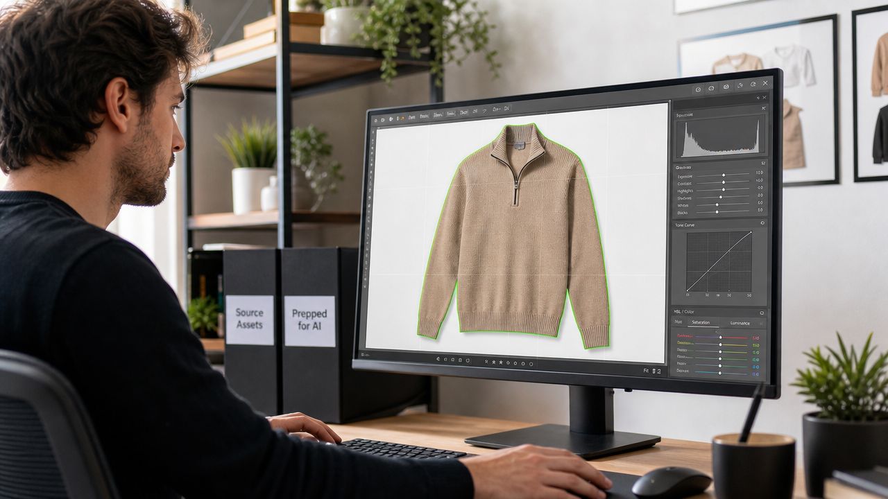
Strong prep standards save money because they reduce two forms of avoidable rework: manual cleanup after the AI pass, and failed batches that need to be redone. For catalog teams, asset prep should sit inside the same QA discipline used for e-commerce product photo editing standards, not as an afterthought at upload.
What the source image needs
The best recolors start from an approved master asset, not a compressed export or an old screenshot pulled from a listing. Resolution matters, but readability matters more. The model needs clean edges, visible surface detail, and enough tonal separation to preserve shadows and highlights after the color change.
Use this filter before any file goes into production:
- Clear garment separation: The item should stand apart from the background and surrounding elements. Overlapping hair, hands, bags, or layered pieces increase masking errors.
- Controlled lighting: Keep lighting balanced across the garment so the model reads shape and depth correctly. Harsh hotspots and deep shadows often create patchy results.
- Visible fabric information: The file needs to show stitching, weave, ribbing, nap, print edges, or surface variation. If the camera did not capture the material properly, the recolor will look flatter than the original.
- Room around the product: Leave space around hems, sleeves, necklines, and side seams so edge handling stays clean.
- Approved color target: Use brand-approved HEX, RGB, or swatch references. Guessing is where consistency starts to break.
Why apparel needs tighter prep than other categories
Apparel is less forgiving than hard goods. A mug, bottle, or phone case can tolerate a more basic color replacement because the surface is stable. Garments are not stable. They fold, stretch, catch light unevenly, and reveal construction details that shoppers use to judge quality.
That is why fabric realism is not a finishing touch. It is a production requirement. If the source image does not clearly show fleece loft, jersey slub, washed denim contrast, or satin sheen transitions, the recolored result can technically match the palette and still fail the product page.
A simple review question helps: will this image still look believable if the color changes but the fabric behavior has to stay the same?
A practical prep checklist keeps that review fast:
- Start with the hero angle. Use the cleanest and most commercially important view first. Validate the workflow there before scaling to the rest of the set.
- Check texture at 100 percent. Do not approve from thumbnails. Zoom in and confirm the file holds stitching, grain, trim definition, and fold structure.
- Remove distractions before recoloring. Clean obvious props, stray shadows, or overlapping elements if they interfere with the garment boundary.
- Group assets by lighting setup. Batch consistency improves when the files were shot under the same conditions.
- Flag difficult materials early. Lace, mesh, sequins, velvet, reflective synthetics, contrast trims, and logo placements often need stricter review or manual correction.
This step determines whether recoloring becomes a reliable workflow or just another cleanup queue.
The Core AI Color Changer Workflow
A good apparel recoloring workflow does one job. It changes color without changing garment identity. In production terms, that means controlling the mask, setting the right target, protecting trims and branding, and reviewing the result against a clear approval standard.
Early in rollout, it helps to map the process visually.
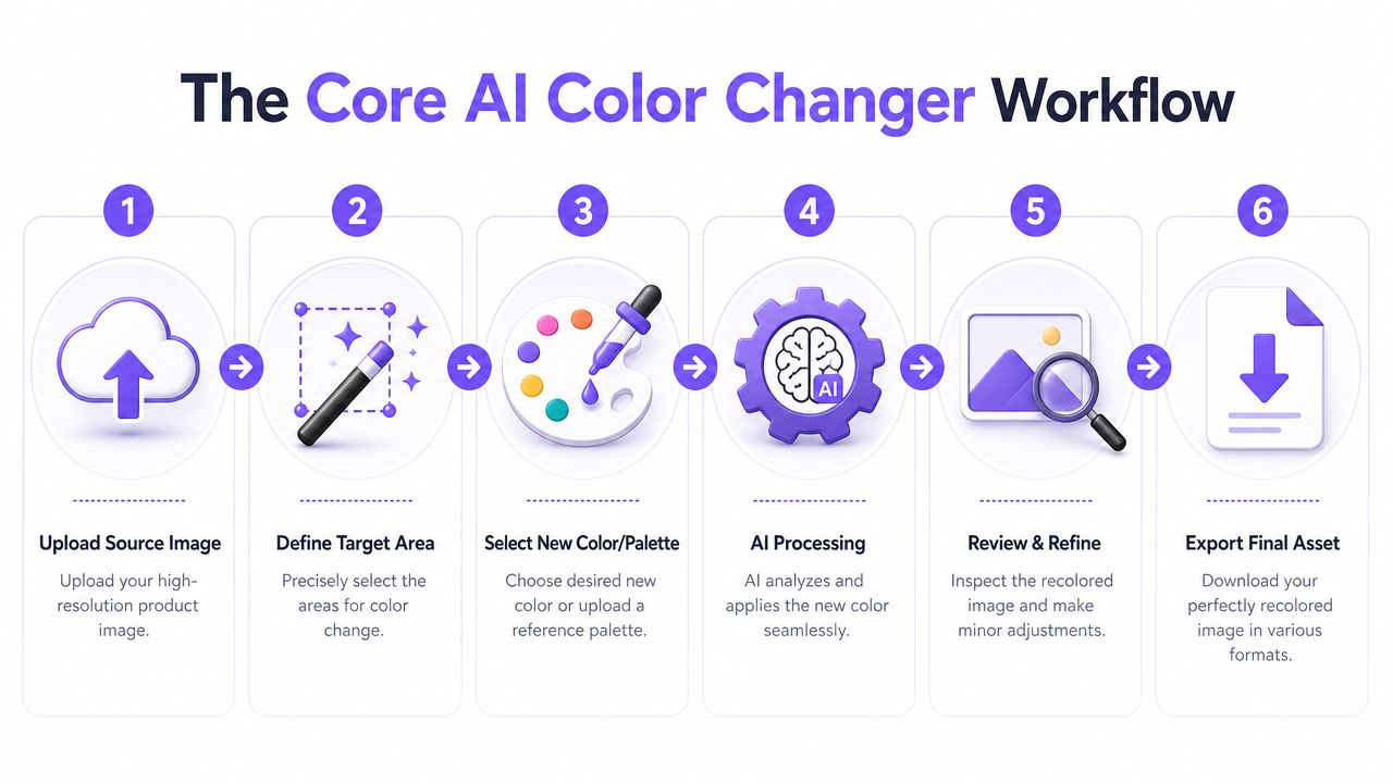
The single-image workflow that works
Start with one approved hero image and treat it as the calibration file for the SKU. That keeps the first pass focused on quality, not volume. If the recolor fails here, scaling it only multiplies the cleanup.
For one SKU, the sequence is straightforward:
- Upload a clean source image. Use the highest-quality approved file, not a compressed export from a PDP or ad platform.
- Define the target area carefully. Mark the garment precisely so the edit does not bleed into skin, hardware, logos, labels, trims, or background.
- Set the output color precisely. Use HEX or RGB values when the shade needs to align with a brand palette, seasonal color plan, or approved swatch.
- Run the recolor. Generate the edit and document the settings if the platform allows it.
- Inspect before export. Review edge quality, trim protection, logo integrity, shadow behavior, highlight retention, and whether the material still reads correctly.
- Export the approved asset. Save it with naming conventions that tie the file to SKU, angle, and color code.
The basic sequence is simple. The control points are where teams protect accuracy.
Mask accuracy comes first. If the selection cuts through collars, cuffs, drawcords, piping, topstitching, contrast panels, or semi-sheer sections, the output may look acceptable in thumbnail view and still fail on zoom. Review the first result at full size before anyone signs off. That check takes minutes and prevents larger cleanup later.
A short demo can help teams visualize where the human checks still matter.
Why color codes matter more than prompts
Prompt language can help in exploration. It is not enough for production approval.
“Make this more navy” is too loose for a real apparel workflow. One operator may push the result cooler. Another may darken it and flatten the folds. A color code gives design, merchandising, and content teams the same target.
Use each input for what it does best:
- Prompts are useful in early testing when the team is narrowing a direction or color family.
- HEX and RGB values keep approved shades consistent across PDPs, marketplaces, and campaign assets.
- Reference images help when the brand has a signature tone that needs visual alignment beyond a numeric value.
In apparel, precision reduces friction. If the merchandiser approves #1F3A5F, the team is no longer debating what “deep navy” means.
When to move from one image to many
Once the hero image passes review, apply the same color target and approval standard to the rest of the image set. Front, back, side, detail, and on-model views should read as one coherent colorway. They should not feel like separate interpretations.
A simple rule works well in production: approve the shade once, then replicate under controlled settings.
This matters because inconsistency is easy to spot in apparel. Shoppers notice when the front view looks cooler than the back view, when a close-up loses the heather texture visible in the hero, or when trims shift tone from one frame to another. Those mismatches create doubt, and doubt hurts conversion.
For teams expanding this workflow into broader production, related systems like AI product photography can help organize variant creation more consistently across channels, as long as the product accuracy standard stays higher than the speed target.
The workflow itself is not complicated. The discipline is. Teams that treat recoloring as a controlled production step get faster variant creation, fewer reshoots, and cleaner assortment coverage.
Beyond Color Swapping: Preserving Fabric Realism
The biggest gap in most AI color changer advice is apparel QA. Many tutorials explain how to change the hue. Far fewer explain how to protect the details that make a shopper trust the image.
That gap is real. A neutral product-editing perspective on AI color changing for product photos frames the challenge as preserving textures, shadows, and small details. For apparel e-commerce, the issue is even tighter. The goal is not just to change color. It is to preserve the garment's original material behavior, stitching, drape, trims, logos, and lighting response so the edited file still looks like the same SKU.
What to inspect after every recolor
Use a QA pass that focuses on realism, not just hue.
| Area to review | What good looks like | Red flag |
|---|---|---|
| Texture | Knit, denim, satin, wool, or fleece still reads clearly | Surface looks smoothed over |
| Stitching | Seams and thread lines stay visible and sharp | Construction details blur or disappear |
| Shadows | Depth still matches the shape of the garment | Shadow areas look muddy or repainted |
| Highlights | Light catches the surface naturally | Specular areas shift unnaturally |
| Trims and logos | Non-target details stay clean and unchanged | Color spills into logos, hardware, labels, or contrast trims |
| Drape | Folds still communicate weight and form | Fabric looks flattened or synthetic |
The fabrics that reveal weak edits fastest
Not every textile reacts the same way.
- Knitwear: Ribbing and stitch definition are easy to lose.
- Denim: Washed areas and seam contrast can get muddy.
- Satin and silk: Highlight transitions often become artificial.
- Black garments: Tonal separation is harder to maintain after recoloring.
- Printed or mixed-material pieces: The edit can spill into zones that should remain untouched.
- Garments with contrast trims or branding: Logos, labels, piping, and hardware require stricter masking and review.
If the output passes a color check but fails a material check, it is not ready. Apparel buyers decide quickly whether an image feels honest. If texture collapses or the lighting stops making sense, trust drops.
Multi-light consistency matters
Many teams run into the same issue. A recolored item may look believable in one image and slightly off in another because the underlying light pattern changes. That is why approval should never happen on a single hero shot alone.
Review across:
- front and back views
- close-ups and full-length frames
- daylight and warmer studio scenes
- PDP crops, marketplace crops, and ad formats
A believable apparel recolor keeps the product truth intact. The color changes. The garment identity does not.
That is the standard that separates useful automation from risky automation.
How to Scale Production with Batch Processing
Once a team has approved a color workflow on a single image, the next challenge is scale. This is where brands either gain efficiency or create a library of almost-matching files.
The operational need is straightforward. A catalog has multiple SKUs, multiple angles, and multiple output channels. If each recolor is handled manually, the process stays slow. If each recolor is automated without controls, the assortment becomes inconsistent.
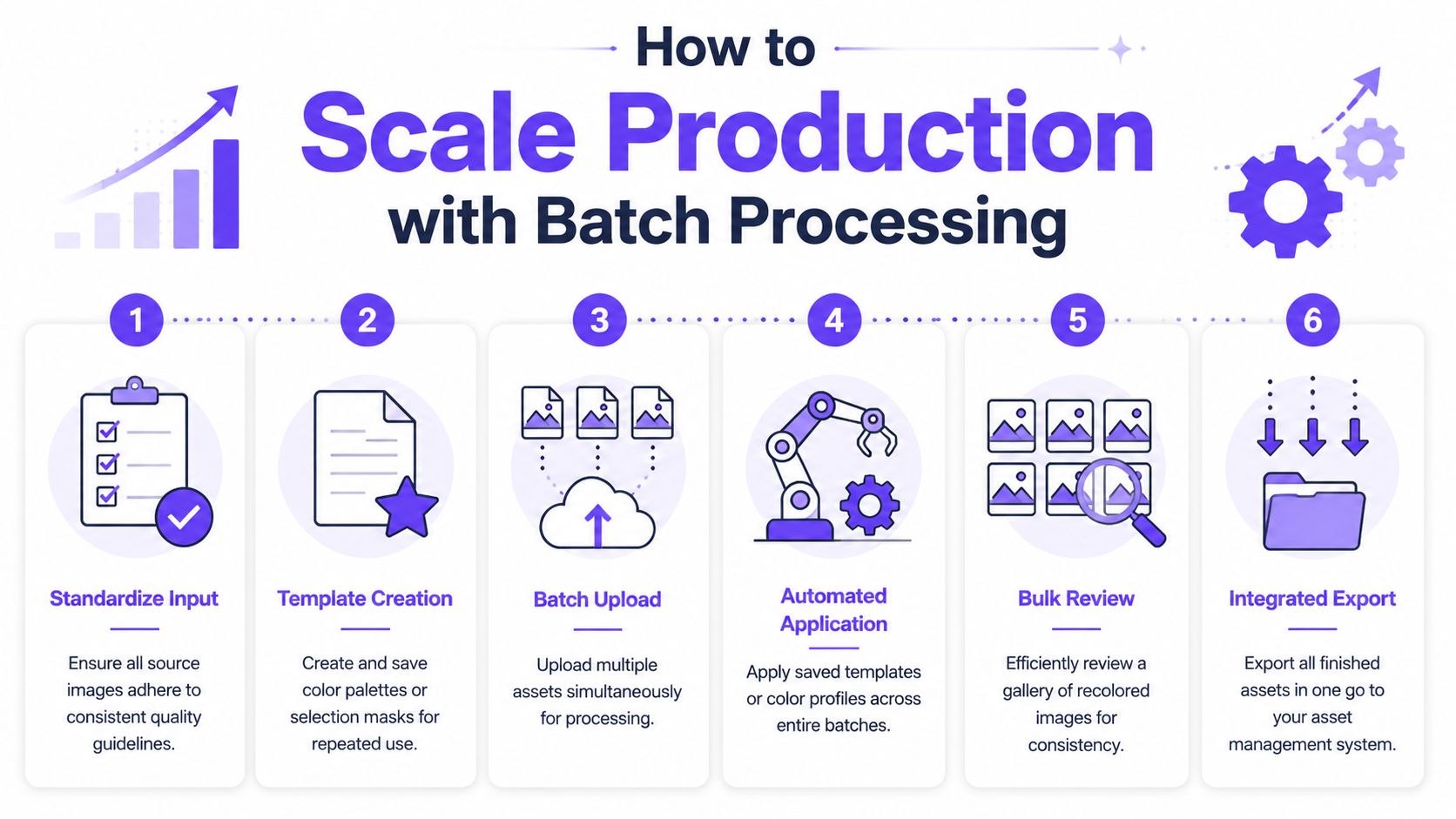
A broader editing view on batch color matching across images points to the same requirement. Brands need workflows that can hold a color family or match a reference look across many SKUs, angles, and backgrounds. That is much closer to real e-commerce production than a one-off recolor demo.
Build a repeatable batch system
For apparel, batch processing works when the standards are locked before upload.
- Group similar assets together: Keep one garment, one lighting setup, or one campaign set in the same batch.
- Lock the target palette: Use approved values, not visual estimation.
- Apply one review standard: Every batch should be checked against the same realism and accuracy criteria.
- Export with structure: File names should clearly indicate SKU, view, and colorway.
If you are building a higher-volume workflow, this becomes part of a larger content operation, similar to the discipline needed in batch generation for product imagery.
What batch processing should solve
A good batch system should answer three practical questions:
- Can the same shade hold across all product angles?
- Can the edit match a reference target without hand-correcting every frame?
- Can the team approve a set quickly without rechecking every file from zero?
If the answer is no, the setup still needs work.
The approval model that keeps quality from slipping
At scale, do not review every image in the same way. Tier the review.
| Review level | What to check | When to use it |
|---|---|---|
| Full review | Texture, stitching, edge quality, trims, logos, and shade accuracy | First batch of a new product type |
| Spot review | A sample from each angle or colorway | Repeat runs with known standards |
| Exception review | Only files flagged by the team | Stable, high-volume workflows |
This is where many brands finally see the benefit. Not because the tool is doing everything on its own, but because the team built a system around it. The fastest workflow is not unlimited automation. It is selective automation with clear controls.
Beyond the Catalog: Practical Creative Use Cases
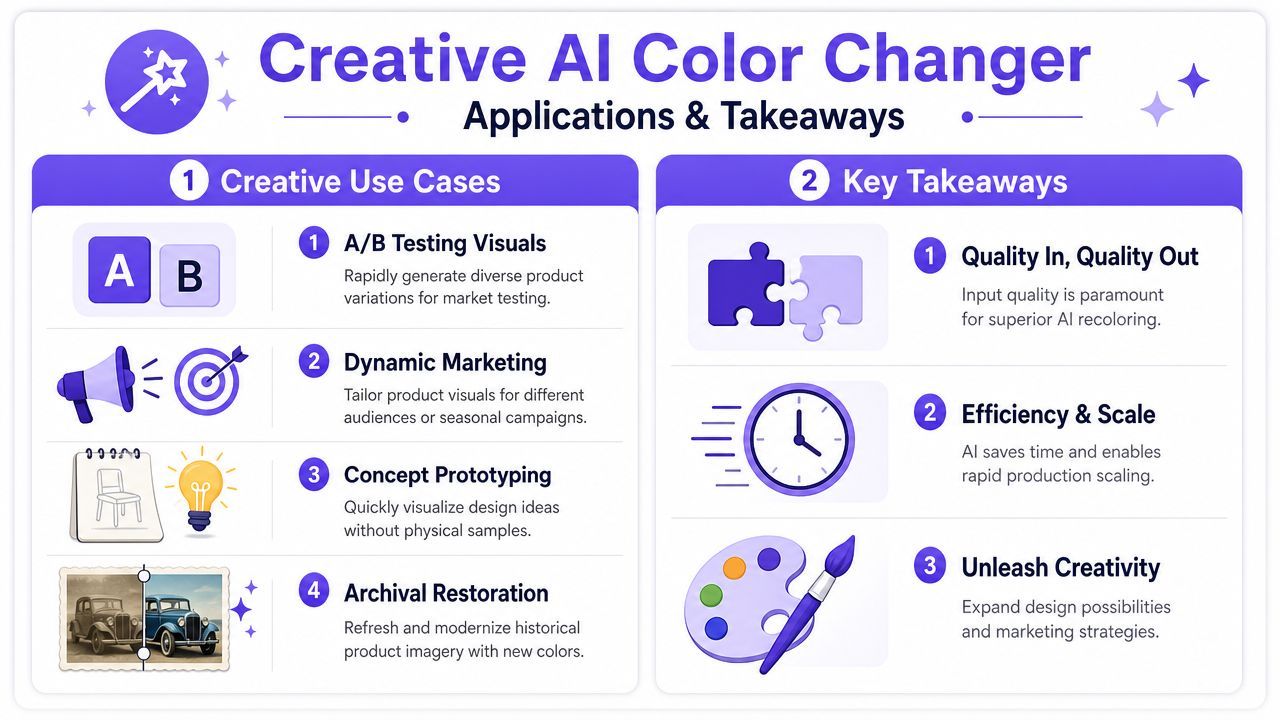
Once the core catalog workflow is stable, an AI color changer becomes useful beyond PDP maintenance. Marketing teams can test alternate color presentations in ads, preview possible colorways before physical samples are ready, and adapt approved assets for different channels without remaking the whole shoot.
That opens up practical uses for apparel brands:
- Ad testing: Try different color variants in paid social creative to learn which direction gets attention.
- Merchandising previews: Show future colorways internally before final range decisions.
- Marketplace adaptation: Extend one approved product set across retail channels while keeping the garment recognizable.
- Social reuse: Refresh older product assets with approved color stories instead of retiring them.
There is also a useful adjacent lesson in broader editing workflows. Teams that already manage alternate versions, ghost mannequin assets, campaign crops, and channel-specific deliverables usually get more value from connected production steps, such as ghost mannequin removal, because color, composition, and garment presentation rarely happen in isolation.
Takeaway
- Start with your best base asset. Recoloring quality depends on visible texture, balanced lighting, clean separation, and a clearly defined garment.
- Treat product accuracy as the approval standard. If shadows, stitching, trims, logos, or drape look wrong, the output is not ready.
- Use exact color targets. Approved HEX, RGB, or swatch references reduce drift across operators, channels, and product views.
- Scale with controls, not assumptions. Batch workflows save time only when palettes, review logic, and file structure are fixed before production.
- Keep human QA in the loop. AI can speed up repetitive variant work, but it does not replace judgment on product truth.
AI color changing is most useful when it removes repetitive production work without weakening customer trust. For apparel brands, that is the line worth protecting.
If you are comparing this approach with your current production setup, review the workflow against your existing content costs with Picjam's pricing calculator. It is a practical way to see whether controlled recoloring and related production steps can reduce repeat shoot work for your brand.

Picjam team
The Picjam team blends AI, product, and creative expertise to eliminate the cost and delay of traditional photography for modern eCommerce brands.