Choose the Best Backgrounds for Products: 2026 Guide
Choose the best backgrounds for products with practical guidance for apparel and ecommerce teams, from white backgrounds to lifestyle, on-model, and textured sets.
By Michael Pirone, Founder of Picjam & Vidico
Backgrounds for products influence how clearly shoppers understand an item, how consistent your brand looks across channels, and how efficiently your team can produce creative at scale.
these eCommerce product photography statistics
For ecommerce teams, the real question is not whether white, lifestyle, or textured backgrounds are "best." It is which background works best for a specific job. Marketplace listings need clarity. PDPs need accuracy. Paid social needs context that stops the scroll without hiding the product.
When teams treat backgrounds as a fixed styling choice, they usually end up with one of two problems. Either everything looks clean but repetitive, or everything looks creative but inconsistent. The better approach is to build a small, repeatable system that matches image type to channel, use case, and product category.
Why Your Product Background Is More Than Just a Backdrop
A product background does more than fill space. It affects how easy the item is to read, how premium it feels, and how confidently a shopper can judge color, shape, texture, and use.
In apparel ecommerce, background choice also changes what kind of question the image answers.
A plain backdrop says, "look closely at the product."
A contextual setting says, "this is how the product fits into real life."
An on-model or lifestyle frame says, "this is who it is for, and how it wears."
Those are different jobs. Strong ecommerce teams do not force one treatment across every asset. They use a controlled mix.
Practical rule: If the background makes the image look better but the product harder to judge, it is probably hurting performance.
Strong brands use backgrounds as a system
A simple operating framework looks like this:
- Marketplace images: prioritize clarity, compliance, and quick recognition.
- Product detail pages: prioritize accuracy, silhouette, fabric, and fit cues.
- Paid social and email: prioritize context, relevance, and thumb-stopping composition.
- Brand campaigns: prioritize mood, identity, and memorability.
That shift matters. Once your team asks, "What does this image need to do?" background decisions become easier to standardize.
For teams planning location-led shoots, references can still be useful during pre-production. This ultimate guide to Cape Town backdrops is one example of how environment selection changes the tone of a shoot before styling begins.
The Foundational Backgrounds Every Ecommerce Team Needs
Before you expand into more expressive creative, you need a dependable baseline. For most apparel and product catalogs, that means clean white backgrounds for core commerce images and transparent cutouts for flexible design use across site modules, campaigns, and ads.
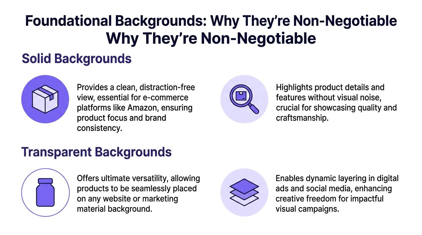
Solid backgrounds create your commercial baseline
this breakdown of white background performance
For hero images, the goal is straightforward. Show the item clearly, preserve color accuracy, and remove distractions.
White remains the default for many ecommerce channels because it is easy to scan, easy to crop, and easy to reuse across marketplaces, PDPs, and merchandising modules. If your team is standardizing output, #FFFFFF is a practical target for a pure white background.
A few details matter more than they seem:
- Keep shadows subtle: A soft grounding shadow can help the item feel real. Heavy shadows usually distract.
- Crop with intention: The product should feel centered and readable on mobile.
- Protect color accuracy: Background tones and reflections should not shift the garment color.
- Keep edge quality clean: Jagged cutouts and haloing lower perceived quality fast.
If your team wants a practical baseline for studio-ready output, Picjam's AI product photography hub is a useful reference point for creating cleaner, more repeatable ecommerce assets.
A broader design reference like discover your ideal color palette can also help teams think through how neutral backgrounds support stronger brand colors elsewhere in the visual system.
Transparent files make downstream creative easier
Transparent PNGs solve a different problem. They make the same SKU easier to reuse across homepage banners, collection tiles, emails, paid social ads, and campaign layouts without cutting the product out again each time.
That flexibility matters when a launch needs multiple versions of the same item in the same week.
A strong product image library is not just a folder of finished shots. It is a set of reusable assets your creative team can deploy quickly.
If your current catalog is inconsistent, this guide to white background product photography is a practical place to start tightening the baseline before adding more variation.
How Lifestyle Backgrounds Improve Context
Once the foundation is in place, the next step is controlled context. In apparel, clean catalog imagery is necessary, but it rarely answers every buying question on its own.

Shoppers often want to understand where a product belongs, how it feels in use, and whether the styling looks credible in a real setting. That is where contextual and lifestyle backgrounds help.
Context helps answer practical buying questions
this article on e-commerce image standards
A blazer on a blank background shows cut and color.
A blazer styled outdoors or in a work setting adds scale, occasion, and attitude.
That is the value of context. It closes part of the imagination gap without replacing the clean commerce image.
Brands like Sézane and Everlane often use this well. Their strongest images do not bury the product in scenery. They place it in a believable environment where the shopper can read proportion, fabric, and mood more easily.
A simple framework:
| Background type | Best use | Risk if overdone |
|---|---|---|
| Contextual setting | PDP support, email, retargeting | Product loses prominence |
| Lifestyle storytelling | Social, campaigns, brand content | Scene feels generic or disconnected |
| Clean studio image | Marketplace, core catalog | Repetition across every channel |
What works, and what usually fails
The biggest mistake is forcing "lifestyle" where it does not belong. If the setting feels random, over-styled, or disconnected from the actual buyer, it creates friction instead of demand.
What usually works:
- Match the setting to the use case: Knitwear in a soft interior, activewear in motion, occasionwear in a fitting premium environment.
- Keep the item dominant: The scene should support the product, not compete with it.
- Use context as support: Lifestyle images should extend the product story, not replace clear selling shots.
For teams building more varied fashion creative without starting from scratch every time, Picjam's AI fashion photography hub shows how to create channel-specific scenes while keeping product presentation consistent.
A short visual example helps show how much atmosphere changes perceived wearability:
AI lifestyle photos for fashion products
The best lifestyle image helps answer a buyer's hesitation before support ever gets involved.
Using On-Model and Textured Backgrounds to Add Depth
Not every product needs the same kind of context. Apparel often benefits most from body, posture, and movement. Accessories and smaller products usually benefit more from surface contrast, scale cues, and controlled detail shots.

On-model imagery makes fit easier to judge
A jacket on a hanger can show construction. A jacket on a body shows shoulder line, sleeve length, drape, and overall proportion. For apparel teams, that difference is often critical on PDPs and in paid creative.
The goal is not to create more images for the sake of it. The goal is to help shoppers understand fit and reduce uncertainty earlier in the journey.
Textured backgrounds can increase perceived quality
For bags, jewelry, beauty products, footwear, and material detail shots, the surface under or behind the product can add useful visual information.
this overview of clothing photography workflows
Stone, linen, matte paper, brushed metal, wood, and concrete all create different signals. Used well, they support the product's material story and pricing position. Used badly, they distract from it.
A practical matching approach:
- Minimal jewelry: stone, matte plaster, brushed metal.
- Leather goods: wood grain, warm paper, muted concrete.
- Modern beauty packaging: polished neutrals, acrylic-like surfaces, soft reflections.
- Technical products: smooth industrial surfaces, subtle metal, low-noise neutrals.
Adobe's article on AI-generated backgrounds for product photography
Use texture to support the product story. If the background has more personality than the item, pull it back.
The strongest textured scenes also manage depth carefully. Slight softness in the background helps the product remain dominant, especially when finish and edge detail do most of the selling.
A Practical Workflow for Consistent Backgrounds
Most teams do not struggle with taste. They struggle with production logic.
Once you need clean catalog images, contextual PDP support, social variations, and campaign assets, production can sprawl quickly. More shoot days, more rounds of feedback, and more one-off edits usually lead to slower launches and less consistency.
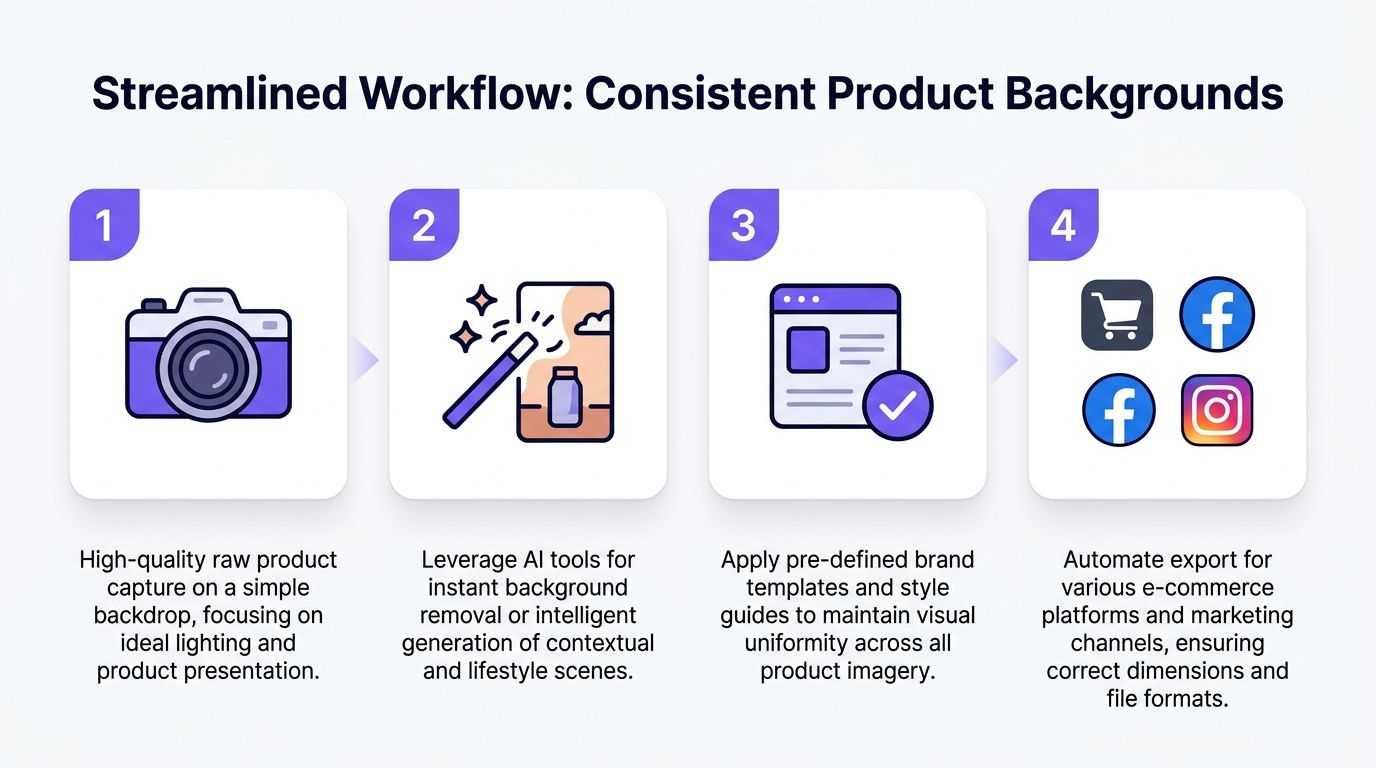
Start with one strong source image
Even when the final output varies by channel, the workflow still benefits from disciplined inputs.
That usually means:
Michael Pirone's LinkedIn post on recent brand workflows
- Capture once: Start with a clean, well-lit source image that preserves color, shape, and material detail.
- Define image types: Decide which background families you actually need by channel and category.
- Version with intention: Create variants for marketplace, PDP, email, paid social, and campaign use.
- Review consistently: Check hems, seams, shadows, logos, edge cleanup, and color before export.
Aim for controlled variation, not endless variation
You do not need unlimited looks. You need a small set of repeatable looks your team can use with confidence.
this AI product photography guide
A handbag brand might standardize around three background families: clean white, premium interior, and editorial street context. A womenswear brand might use studio, soft natural interior, and urban texture.
That kind of system is where a tool like Picjam fits. One clean product image can support multiple on-brand outputs without turning every launch into a new production cycle. Teams that want a more hands-on look at implementation can also book a demo.
If you are refining operations first, this product photography workflow guide is a useful place to tighten the process before expanding creative variation.
Consistency does not come from using one background everywhere. It comes from using the same decision framework every time.
Your Action Plan for Better Product Backgrounds
If your image library feels inconsistent, do not start by planning a bigger shoot. Start by clarifying what each image needs to accomplish.
Build a usable background portfolio
Review your current images and sort them into working groups:
- Marketplace-safe
- PDP support
- Social-first
- Campaign or editorial
Most brands already have some of these assets. The gap is usually not content. It is organization.
Map each background to a channel goal
Give each image type one primary job.
- Clean backgrounds for clarity
- Contextual backgrounds for realism
- On-model imagery for fit
- Textured surfaces for detail and perceived quality
Once that mapping is clear, reviews and approvals get faster because the team stops judging every image against the same standard.
Scale from a strong core set
Start with a dependable base image set. Then expand into channel-specific outputs through a repeatable workflow, not a separate production process for every launch.
That is the practical path to more content without adding unnecessary complexity.
Takeaway
- Protect the baseline: Keep clean, accurate catalog imagery for channels where clarity matters most.
- Use context selectively: Add lifestyle, on-model, and textured environments where they improve understanding of fit, use, or quality.
- Standardize the system: Treat backgrounds as an operating framework, not a one-off creative choice.
If you are comparing your current process against a more flexible content workflow, try the Picjam savings calculator. It is a simple way to estimate how much production time and budget you could save by moving from repeated shoots to a more scalable image system.

Picjam team
The Picjam team blends AI, product, and creative expertise to eliminate the cost and delay of traditional photography for modern eCommerce brands.