Saturation Control for Fashion Images That Sell
Practical saturation control for fashion ecommerce. Keep garment color accurate from shoot to web export with clear workflows, editing rules, and QA checks.
A customer orders a red dress after seeing a vivid scarlet product image. The parcel arrives, and the dress looks darker, flatter, and less saturated than expected. That gap often starts in post-production, not in the warehouse. A color edit meant to make the image pop changes how the product itself is understood.
For apparel ecommerce teams, saturation control is not a finishing touch. It is part of product accuracy. If the garment color shifts between the rail, the studio file, the PDP, the marketplace export, and any AI-assisted variant, shoppers lose confidence and returns get harder to explain.
Picjam can help teams produce more imagery from existing assets, especially when they need new on-model or campaign-style outputs without repeating every shoot. But faster production only helps if the garment still looks like the garment. That is why saturation control needs to be treated as an operating rule, not a creative effect.
This guide covers the basics of HSL, when to use vibrance instead of saturation, how to handle selective edits, and how to build a shoot-to-web workflow that keeps color believable at scale.
Why Saturation Control Affects Conversion and Returns
Shoppers do not see your sample, your set lighting, or the retoucher's monitor. They see the final pixels and make a buying decision from them. If the product page shows a cool, punchy blue and the delivered item looks softer and greener, the customer reads that as a product mismatch.
That makes color fidelity a merchandising issue. Good product imagery should make the garment look appealing, but it also has to keep the product recognizable. Pushing saturation can make thumbnails stand out. It can also make knit texture collapse, reds look synthetic, and similar shades lose separation.
The problem gets worse when one catalog pulls from different sources. A flatlay, a studio mannequin shot, a model composite, an AI-assisted campaign asset, and a marketplace crop can all render the same SKU differently. If every file is corrected by eye, the catalog stops feeling reliable.
Working rule: treat the garment as the source of truth. Styling, background, and context can change. The product color should not.
That applies whether the image comes from a camera or from a generated workflow. Teams using AI fashion photography to expand existing product assets still need an approval step for color before anything goes live. The same is true for traditional capture. Strong product photography equipment helps, but process matters more than gear if the goal is consistent product color.
A dependable workflow answers three questions:
- Is the hue right?
- Is the saturation believable?
- Did the edit remove detail in highlights, folds, or channels?
What Saturation Control Actually Means
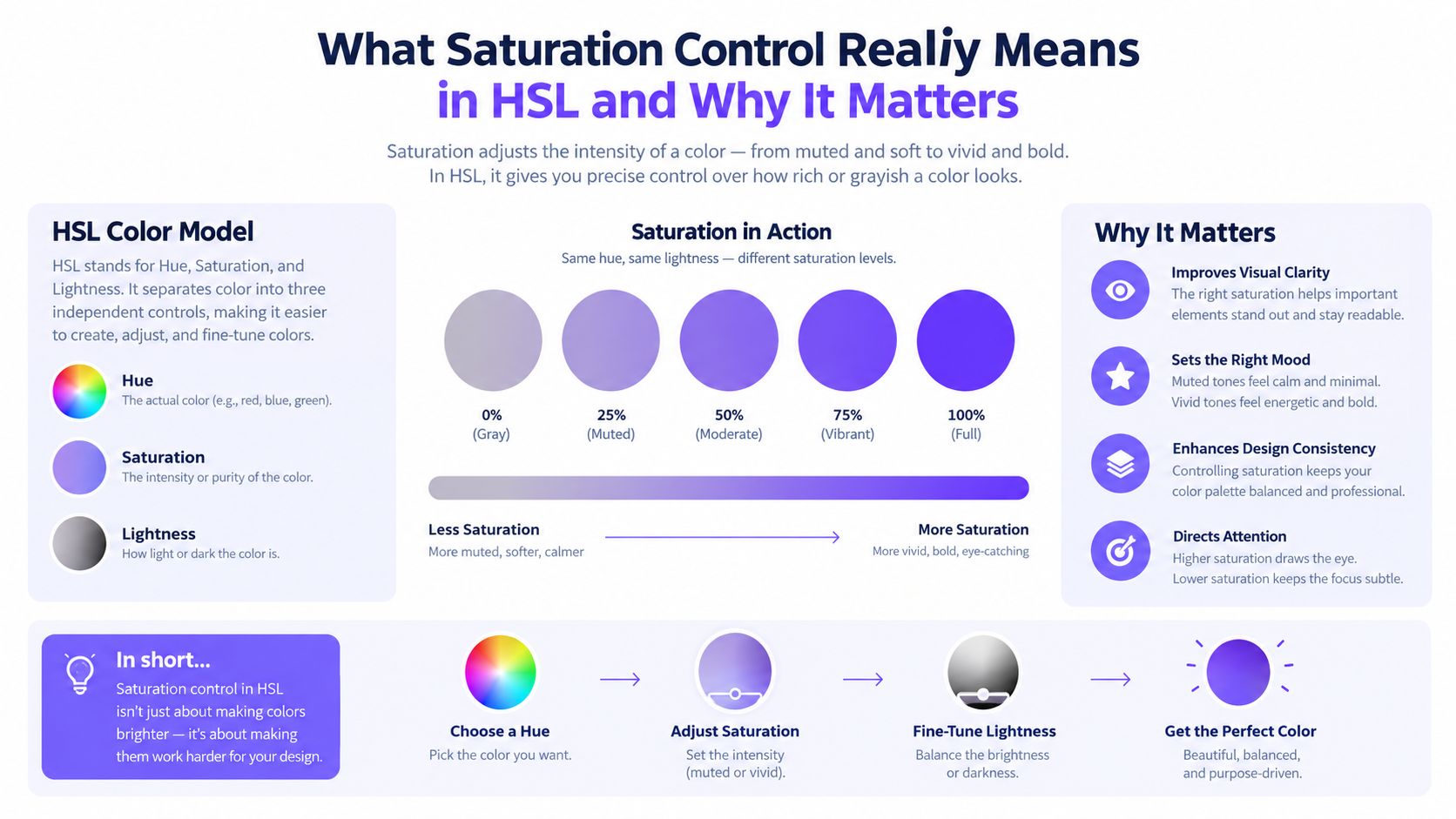
At a practical level, you are balancing three separate things:
- Hue: the color family, such as red, blue, or green
- Saturation: how intense or pure that color appears
- Lightness: how bright or dark the color looks
HSL matters because these controls solve different problems. A blouse can stay red while becoming less intense. It can also stay equally saturated while becoming lighter. Those are not the same edit, and mixing them up is one of the fastest ways to make fabric look fake.
Saturation and vibrance are not interchangeable
A global saturation slider pushes most colors in the frame in the same direction. That can be useful when the whole image is flat for a genuine technical reason. It is risky when only one garment or one hue range is off.
Vibrance is usually safer as a first move. It tends to lift muted colors more gently and avoid pushing already-strong colors as hard. That makes it useful when a set looks a little lifeless, but your strongest garment colors are already close.
Lightness is separate again. If a navy knit looks too gray, raising lightness may make it look washed out rather than richer. If you compensate by adding too much saturation, folds and edges can start to clip or feel overdrawn.
The safe limit changes by hue
Not every color tolerates the same saturation increase. In HSL-based grading, saturation is often shown as a simple percentage, but different hues hit clipping at different points. A useful technical example shows an olive-green sample clipping at about +42%, while other hues behave differently, as explained in this technical discussion of HSL saturation and clipping.
That is why preset testing needs to happen on more than beige and gray. Check it on red, orange, cobalt, emerald, and deep neutrals before you trust it across a category. Teams handling motion as well as stills may also find useful context in this piece on how AI speeds up video grading, but the same rule applies in both formats: speed is fine, reference-free color decisions are not.
For a broader foundation, it also helps to connect these editing decisions with colour theory in fashion. The goal is simple. Make the product look strong without changing what the shopper thinks they are buying.
How Saturation Changes Perceived Fabric Quality
Saturation does more than change color intensity. It changes how shoppers read fabric.
A cotton tee with restrained color usually keeps visible weave, soft fold transitions, and natural tonal variation. Push the color too far and that detail starts to compress. Satin is even more sensitive. Too much saturation can make highlights look painted on, while shadows lose the nuance that tells the shopper how the fabric behaves.
Background choice matters too. If the backdrop is loud and the garment is also globally boosted, the product can start to look detached from the model's skin, hardware, shadows, or surrounding items.

Watch red garments closely
Red apparel needs its own review step. Reds often reach channel limits earlier than neighboring colors, so a red dress can look overcooked while a gray blazer in the same frame still looks fine. The failure is not just stronger color. It is lost separation in seams, folds, highlights, and texture.
Adobe Camera Raw explains that very bright values can clip to output white, while very dark values can clip to output black. In practice, that means saturation edits cannot be separated from highlight and shadow review. A garment can keep the right general hue while losing the texture cues that make it feel real.
MIT CSAIL guidance recommends setting the brightest region of interest just below the saturation point in single-shot capture workflows. For apparel teams, that means checking the brightest fabric highlight, not just the overall histogram. If a fold highlight is already near the limit, more saturation can erase detail the customer needs to judge finish and quality.
PDPs need tighter control than ads
A campaign image can carry a stronger grade if the product still reads clearly. A PDP or marketplace image has a different job. It needs to represent the garment accurately enough for size, color, and material decisions.
That is especially important for basics-driven brands. A small shift in navy, cream, olive, or seasonal accent colors can distort how customers compare products across a range.
Simple review rule: if you notice the grade before you notice the garment, the edit is probably too strong.
The same distinction matters in video and campaign work. A useful reference for planning commercial video projects can help teams separate expressive treatment from reliable product representation.
When to Use Global Saturation, Vibrance, or Selective Edits
The right control depends on the problem.
| Control Type | Best For | Watch Out For |
|---|---|---|
| Global saturation | Small correction when the whole image is consistently flat | Overpushing strong garment colors, skin tones, and backgrounds |
| Vibrance | Lifting muted palettes without hitting already-intense colors as hard | Expecting it to fix hue shifts or clipped channels |
| Targeted Hue/Saturation | Correcting one garment, one hue range, or one camera response issue | Halos, rough masking, uneven color across the product |
| Regional masking | Holding back backgrounds or props while preserving garment color | Spill on seams, trims, buttons, hair, and transparent materials |
Use global changes only when the problem is global
If the whole frame is a little dull because of a profile or capture issue, a small global move can work. It should not be used as a shortcut to fix one warm orange sweater inside an otherwise neutral scene.
Photography editing guidance often suggests increasing saturation in small steps of about +5 and rarely going past about +20, because larger moves can make color look artificial and flatten detail. This comparison of vibrance and saturation gives a clear practical explanation for that approach.
For muted pastel collections, start with vibrance. For a warm light shift affecting one cream fabric, target that hue range. For red-heavy categories, do not make a global boost until you have checked highlights and folds in the red channel.
A practical decision path for apparel teams
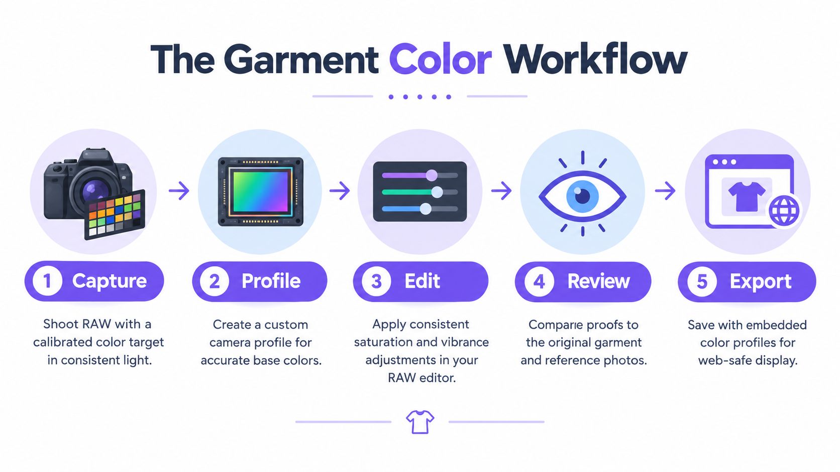
Before you touch a slider, ask:
- Are all colors muted? Start with vibrance or a very small global correction.
- Is one garment or hue wrong? Use a targeted correction against a physical or approved reference.
- Is the product fine, but the background too loud? Reduce the background selectively. Do not compensate by pushing the garment.
AI photography for merchandising teams
Teams exploring AI product photography should use the same decision path for generated variations. More outputs do not mean every image needs more color. The same logic also applies to Picjam's guidance on ecommerce photo editing, where consistency depends on separating product correction from creative styling.
A Practical Workflow for Accurate Garment Color
If the reference is unstable, the edit will be guesswork. The workflow below keeps saturation decisions anchored to the product.
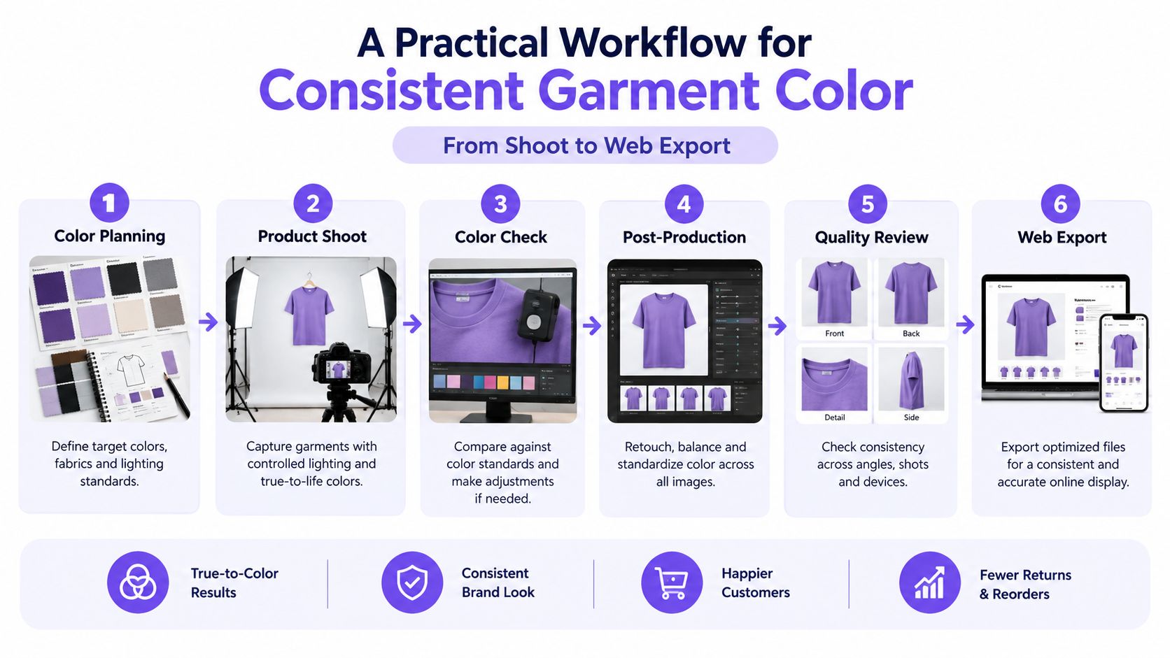
1. Capture a trustworthy reference
Place a calibrated color checker card in the same lighting as the garment. Do not shoot it in a similar setup later and assume the result will match. The card gives the retoucher a stable reference for white balance, hue, and intensity.
Shoot in RAW. RAW does not guarantee good color, but it gives you more room for controlled correction than a heavily processed source file.
2. Build a session-specific profile
Create a custom camera profile for the session. The point is to describe how that specific camera, lens, and lighting setup renders color, not to force every shoot through one generic preset.
Compare the garment with the reference before doing any creative grading. If the neutral patches or red patches are already off, fix that first. Saturation is not a substitute for proper white balance or profiling.
3. Correct exposure and white balance before saturation
Set exposure and white balance first. Then decide whether the image needs vibrance, global saturation, or a targeted fix.
Keep the brightest garment region just under the saturation limit. MIT CSAIL's guidance on the brightest region of interest is useful here because garment highlights are often the first place detail disappears. Check sleeves, trims, raised folds, and pale panels against clipping warnings in your RAW editor.
4. Batch only after one master is approved
Approve one master image before applying settings across a collection. Test that master on the hardest colors in the range, especially reds, oranges, greens, and deep blues.
Batching works when lighting, profile, and garment conditions are stable. If the source comes from mixed sessions, split it into groups and review each group separately. One preset across inconsistent files is where drift starts.
5. Check AI-assisted outputs against the approved product image
If you create new model imagery, alternate settings, or campaign variants from existing assets, compare the garment back to the approved source. Review at normal viewing size, then zoom into seams, folds, texture, and edges.
AI-assisted production can save time and reduce repeat shoots. It can also introduce small color or texture changes that are easy to miss when you only review the full frame. Human approval still matters wherever the product itself is being sold.
6. Export the web file and inspect that version
Embed the correct color profile on export and inspect the actual web-ready file, not just the working file. Review it in context, where page background, UI white, thumbnail size, and neighboring products all affect perception.
Use a short QA pass:
- Reference match: compare against the approved source or physical sample
- Channel check: inspect red-heavy and highly saturated areas for clipping
- Detail check: confirm folds, seams, highlights, and texture are still visible
- Catalog check: compare neighboring SKUs side by side for drift
- Placement check: review the final file in its PDP, ad unit, or marketplace crop
How to Scale Saturation Control Without Losing Accuracy
Small catalogs can survive informal review. Larger apparel operations need rules.
Start by separating production automation from color approval. Presets, batch edits, and AI-assisted asset generation are useful when they speed up repetitive work. They are not a reason to skip approval of product color.
Create one master preset for each controlled lighting and camera group. Store the profile, white-balance approach, tonal limits, and preferred vibrance behavior with that setup. Keep targeted garment fixes separate so one correction does not quietly spread to unrelated SKUs.
Good uses of automation
Automation works well for:
- Applying approved settings to files from the same capture condition
- Flagging outliers such as clipped highlights, intense channels, or unusual darkness
- Preparing variants such as crops, placements, and channel-specific exports from an approved master
- Extending existing assets into new visual contexts when the garment remains faithful
This is where a platform like Picjam can be useful. It gives teams a way to create more sellable imagery from existing product assets, but the brand still controls the color master and approval rules.
Keep a human checkpoint
A trained reviewer should approve:
- The source master
- The first file in any batch
- A sample of final exports across placements
That review can stay simple:
- Reference swatch: does the garment keep its intended hue and intensity?
- Side-by-side catalog view: does it sit naturally beside related products?
- Channel inspection: are reds, oranges, or other strong colors losing detail?
- Asset comparison: does the AI-assisted variant still match the source product?
- Web preview: does the export hold up in its live placement?
Takeaway
Saturation control should protect the product before it improves the image.
For apparel brands selling online, the practical approach is straightforward:
- capture a real reference in the same light as the garment
- shoot in RAW
- build a session-specific profile
- use the narrowest correction that solves the problem
- review red garments and bright highlights for clipping
- inspect the final web export in context before publishing
Use vibrance when a muted image needs a small lift. Use targeted Hue/Saturation when one fabric or one hue has shifted. Use global saturation only when the whole frame genuinely needs a restrained correction.
If you are using Picjam to generate additional product or fashion imagery from existing assets, keep those outputs tied to an approved color master. That is how you get speed without losing trust.
Compare your current photography process with Picjam's potential savings using the Picjam savings calculator.
Picjam helps fashion brands create more product imagery and campaign variations from existing assets, with a workflow that can support faster production and tighter catalog consistency. Visit Picjam to explore the platform, then use the savings calculator to compare the time and production spend against your current process.

Picjam team
The Picjam team blends AI, product, and creative expertise to eliminate the cost and delay of traditional photography for modern eCommerce brands.