Visual Merchandising Online: A Guide for Fashion Brands
Master visual merchandising online. Our guide for fashion brands covers KPIs, imagery, page layout, CRO, and AI workflows to boost engagement and sales.
By Michael Pirone, Founder of Picjam & Vidico
Tagalys' overview of online visual merchandising
Visual merchandising online works best when it runs like a commercial operating system.
For fashion brands, the job is clear. Score what matters, then generate what the storefront needs. Decide which SKUs deserve more visual depth, where shoppers are hesitating, and which pages need better clarity. Then produce the right assets fast enough to keep pace with the range.
That is the difference between a site that looks good in review and a site that sells consistently.
Too many teams still treat visual merchandising as campaign output. The homepage gets refreshed. A few PDPs get attention. The rest of the catalog falls back to thin galleries, inconsistent crops, and slow updates. That is not just a creative problem. It is a trading problem.
Your Digital Storefront Starts with Strategy
Strong visual merchandising online starts with commercial priorities.
The storefront follows the same logic as a strong physical store, but with less room for error. Category grids shape first impression. Navigation controls discovery. PDP galleries do the work a store associate would do in person. Every visual choice either reduces friction or adds it.
The strongest teams do not start by asking what should look exciting. They start by asking what the shopper needs to understand, and what the business needs to move.
Think like a merchant, not only a creative team
Fashion teams rarely struggle to generate ideas. They struggle to turn those ideas into enough usable assets across the full catalog.
Wispra's guide for ecommerce owners
A concept can look strong in a campaign deck and still underperform online if the team cannot produce the right crops, alternates, detail shots, mobile-first variants, and styling frames for the products that matter most.
That is why strategy should start with production logic.
Three questions set the direction early:
- What product story needs to land first. Fit, fabrication, occasion, or styling versatility.
- Where does the shopper hesitate. Discovery on collection pages, confidence on PDPs, or basket building through outfit pairing.
- How much asset volume can the team actually support while keeping image quality and consistency intact.
Stores perform better when visuals answer buying questions in the order shoppers ask them.
Production capacity shapes merchandising quality
The main constraint is not taste. It is output.
A brand can have strong art direction and still underperform if the team cannot maintain visual consistency across hundreds or thousands of SKUs. Merchandising quality depends on asset depth, refresh cadence, and how quickly the team can respond to new arrivals, low-converting pages, and seasonal changes.
That is where score-then-generate becomes practical. First decide which products and pages need visual improvement. Then generate the missing variants, alternate crops, model context, or supporting frames needed to close the gap.
Used well, this speeds up page updates, expands what the team can test, and keeps the storefront current without rebuilding the content pipeline every time the assortment changes.
Define Your Goals Before You Design
Teams waste time when the brief stays at the level of taste. "Make it feel elevated" creates debate. "Show drape clearly by image two and improve outfit-pairing clicks on PDPs" creates decisions.
Visual merchandising online works when each asset has a job.
Start with the commercial outcome
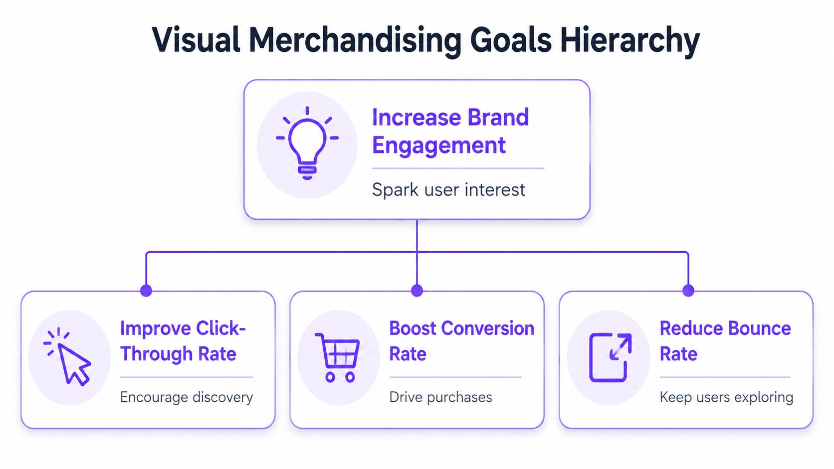
Most visual plans need to improve one of four outcomes first:
- Increase product discovery by moving more shoppers from collection pages into PDPs.
- Improve buying confidence so product pages answer fit, fabric, and quality questions early.
- Grow basket size by making outfit logic and cross-sells easier to understand.
- Reduce expectation gaps so the delivered product matches what the shopper believed they were buying.
Each goal changes the asset mix and image order. Discovery needs stronger first-frame thumbnails and cleaner category presentation. Confidence needs better detail density and gallery sequencing. Basket growth needs styling context that helps, not editorial noise.
Turn the goal into a KPI the team can influence
Broad goals are not enough. The team needs metrics it can act on.
| Business objective | Visual merchandising KPI | What to review |
|---|---|---|
| Increase discovery | Category page click-through rate | Thumbnail clarity, crop consistency, image order |
| Improve purchase confidence | Add-to-cart rate from PDP | Gallery sequencing, detail depth, zoom usefulness |
| Keep visitors exploring | Bounce rate and page progression | Navigation clarity, collection structure, visual hierarchy |
| Grow basket size | Cross-sell interaction and outfit clicks | Styled modules, related product imagery, editorial pairings |
This gives creative, merchandising, and growth teams a shared definition of success before production starts.
Match the visual treatment to the buying question
AI fashion photography workflows for ecommerce teams
The best visual treatment depends on the question the shopper is trying to answer.
A premium dress shopper may need silhouette first, movement second, and fabrication detail before they reach the size selector. A denim shopper usually needs fit and rise immediately. Knitwear often sells better when texture appears earlier in the gallery.
Practical rule: If the first image does not make the main selling point obvious, the gallery is doing too much work.
Strong visual merchandising online is less about variety and more about sequencing the right evidence.
Define "better" before production starts
its online visual merchandising guidance
Before a team commissions, edits, or generates anything, write the target state clearly:
- What should the shopper understand immediately
- What should image two clarify
- Which detail is most likely to remove hesitation
- Which styling cue can increase consideration or basket building
This exposes where the bottleneck sits. Hero imagery may need careful art direction. The repeatable layer is usually where the system slows down: alternate crops, model swaps, regional variations, and extra merchandising frames for high-priority SKUs.
For that layer, tools like Picjam's AI fashion photography workflow are useful when the goal is to create more approved merchandising outputs from a smaller source set, without expanding traditional production overhead each time.
Build Your High-Converting Visual Asset Library
The best ecommerce stores do not rely on one perfect photo set. They build an asset library that can answer different customer questions across different surfaces.
That library needs breadth, not clutter.
Give each asset type a role
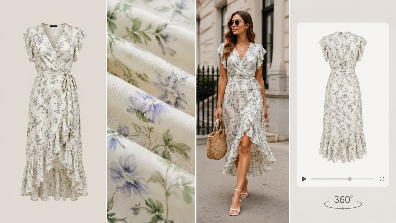
In fashion, a useful asset library usually includes:
- Silhouette images for quick product understanding on category pages.
- On-body context frames for proportion, fit, drape, and styling.
- Close detail shots for texture, trim, closures, stitching, and fabrication.
- Movement assets where static imagery undersells the garment.
- Color and variant visuals to reduce uncertainty when shoppers compare options.
What does not help is filling the gallery with near-duplicates. More frames do not automatically create more clarity.
Consistency beats novelty
A scattered asset library makes the storefront harder to trust.
When image sets vary too much in lighting, crop logic, retouching style, or model direction, shoppers have to work harder to compare products. That friction shows up fast on collection pages.
The most useful consistency rules are operational:
| Asset element | Keep consistent | Allow variation |
|---|---|---|
| Background treatment | Across core product set | In campaign modules |
| Crop logic | Within categories | For editorial storytelling |
| Color rendering | Across all selling images | Never as a stylistic effect |
| First-image purpose | Product clarity | Not concept-first ambiguity |
Build for reuse, not for one launch
Many teams overspend because they build for the campaign first, then discover they still need marketplace variants, ad tests, mobile crops, refreshed collection pages, and mid-season updates.
A better asset library is modular. One source set should support multiple outputs.
For example, a dress launch might require:
- Core PDP imagery
- Category grid thumbnails
- Alternate first images for testing
- Social cutdowns
- Product video
- Seasonal campaign adaptations
- Regional creative variations
That production stack gets expensive quickly if every variation requires a new shoot.
The most profitable asset is the one you can reuse across multiple placements without lowering brand quality.
Add motion where it answers a real question
Video belongs in the asset library when it removes ambiguity.
For soft tailoring, dresses, knitwear, and wide-leg silhouettes, short motion assets can explain what static frames struggle to show. The clip should clarify movement, fit, or styling. It should not slow the buying path.
Contravision's visual merchandising statistics and guidance
A simple example of how motion can support product understanding sits below.
What scalable teams do differently
Scalable teams separate asset capture from asset deployment.
They do not assume one output format will serve every need. They create a source library that can be recomposed for category pages, PDPs, paid media, and seasonal refreshes.
They also plan for repeatable adaptation. When a product needs new model context, alternate styling, or market-specific variants, systems such as Picjam's AI virtual model workflow can help extend approved source assets without resetting the whole production process.
Master Your Page-Level Visual Composition
An asset library only works if the page composition does the selling.
this guide to Shopify product image size
Most conversion issues are not caused by bad images. They come from weak sequencing. The right image appears too late. The grid is hard to scan. The hero delivers mood when the shopper needs clarity.
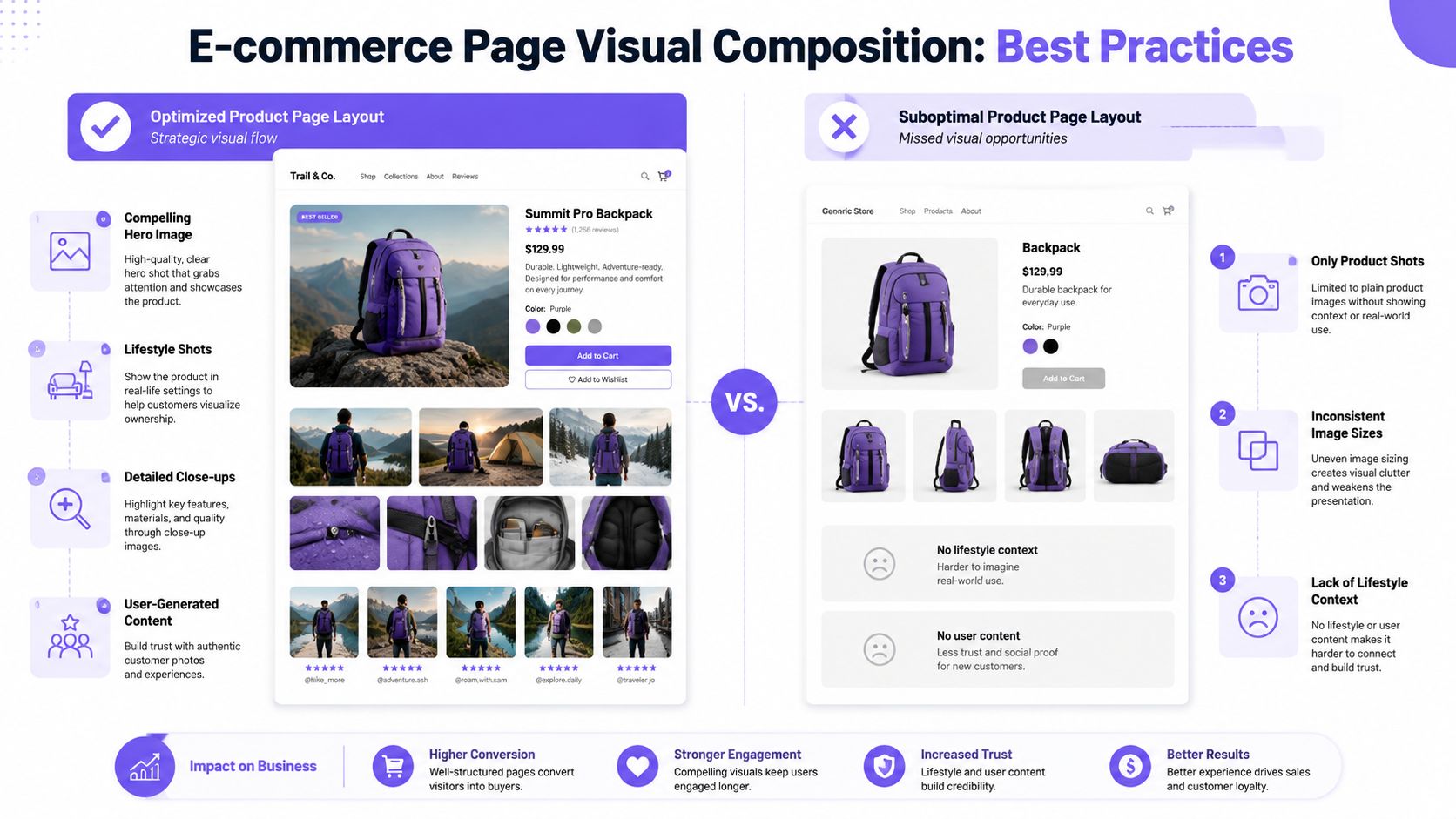
Compose the homepage like a storefront entrance
The homepage hero has one job. It should tell the shopper what world they entered and where to go next.
For fashion brands, that usually means combining a strong campaign frame with a clear route into a collection, category, or drop. What fails is a hero that looks editorial but hides shopping intent.
Build category pages for scan speed
Collection pages are where visual merchandising online becomes operational. Shoppers are comparing, filtering, and judging relevance quickly.
Useful rules for product listing pages:
- Keep first-image logic stable so products are comparable at a glance.
- Mix image types carefully if you use both on-model and product-first thumbnails.
- Avoid noisy crops that hide shape or reduce legibility on mobile.
- Use filters and sorting as visual tools, not just technical utilities.
A category page should feel easy to scan. If every tile asks for equal attention, none of them win it.
Sequence PDP images to match shopper questions
The PDP should remove uncertainty in order.
A good gallery usually starts with the clearest selling frame, then answers the next obvious questions. For apparel, that sequence often moves from overall look to fit on body, then detail, then material, then alternate angle, then styling or movement.
A practical sequence might look like this:
- Hero image with immediate silhouette clarity
- On-model angle showing fit and scale
- Back or side view for shape confirmation
- Detail crop for fabric or construction
- Variant or styling frame for outfit context
- Video or motion asset if movement matters
If image one through four all communicate the same thing, the gallery is not doing its job.
Design for thumbs first
its article on online visual merchandising tactics
Mobile changes composition more than many desktop-first teams admit.
Tall imagery usually reads better than wide editorial crops. Detail shots need to survive small-screen viewing. Video cover frames matter because the first still determines whether the shopper taps. Carousels should feel intentional, not endless.
| Page area | Strong visual choice | Weak visual choice |
|---|---|---|
| Hero | Clear campaign plus route to shop | Ambiguous editorial image |
| PLP tile | Consistent silhouette-first thumbnail | Inconsistent mixed crops |
| PDP gallery | Logical answer sequence | Random image ordering |
| Mobile gallery | Tall, legible, thumb-friendly frames | Tiny details in wide crops |
Page composition is merchandising. When the layout leads with clarity, the product has a better chance to sell.
Test Measure and Optimize Your Visual Strategy
Visual merchandising online should run like a conversion program, not a one-off creative review.
Once the page is live, customer behavior makes the next decision easier. Visual choices can be tested, measured, and improved instead of defended on instinct.
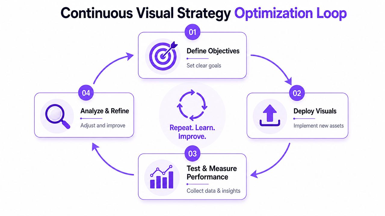
Test the variables that change buying confidence
Not every visual test is worth running. The useful ones target friction.
Strong candidates include:
- First-image type on PDPs, such as model-first versus product-first
- Gallery order, especially where detail or back views appear
- Thumbnail crop style on category pages
- Navigation labels and ordering
- Video cover frames
- Recommendation modules paired with different image treatments
A weak test changes five things at once. A strong test isolates one variable that might change a shopper decision.
Operator note: Test the frame that changes understanding, not the one that only changes mood.
Picjam's guide on improving ecommerce conversion rates
Write hypotheses that a merchandiser can act on
Good hypotheses are specific and visual.
For example:
- Lifestyle image first may improve add-to-cart on occasionwear
- Moving a detail image earlier may help knitwear shoppers judge quality faster
- Cleaner collection thumbnails may improve click-through in dense categories
This creates a usable feedback loop between merchandising, design, and trading teams.
Do not ignore search visibility and accessibility
Image SEO and accessibility are part of merchandising hygiene.
Descriptive file names, accurate alt text, and consistent product labeling help search engines understand the page and help shoppers using assistive technologies. In practice, that means naming the garment, color, and product type clearly instead of relying on internal studio file names.
Build a repeatable review rhythm
The teams that improve fastest usually review visuals on a predictable cadence.
| Weekly review | Monthly review |
|---|---|
| Check top PDPs, category performance, and recent test outcomes | Reassess image standards, asset gaps, and segment behavior |
| Flag weak first images and poor gallery sequences | Update visual rules by category |
| Review mobile experience | Prioritize next production batch |
Treat creative output as operating inventory. Some assets work harder than others. Some need replacing. Some deserve broader rollout.
Actionable Takeaways for Your 2026 Strategy
The goal is not more content. The goal is a visual system that helps shoppers decide.
Start with the buying question, not the moodboard. If a page needs to sell fit, lead with fit. If it needs to sell material quality, make texture easy to inspect. If it needs to build baskets, show the styling logic clearly.
Build an asset library, not a one-off shoot output. Teams that can reuse, adapt, and test assets across PDPs, category pages, social, and campaigns move faster and spend more intelligently.
Treat visual merchandising online as a live system. Review pages, test sequencing, improve thumbnails, and keep refining what customers respond to.
Takeaway
- Define the job of each image. Every frame should answer a shopper question.
- Create for reuse. Build source assets that can support multiple outputs.
- Test what changes clarity. First images, gallery order, and mobile crops usually matter more than cosmetic tweaks.
- Run score-then-generate. Prioritize the products and pages that need help, then produce only the assets that move performance.

Picjam team
The Picjam team blends AI, product, and creative expertise to eliminate the cost and delay of traditional photography for modern eCommerce brands.