White Balance Adjustment for Fashion Product Photos
Master white balance adjustment for fashion product photography — in-camera presets, Kelvin, RAW fixes and e-commerce workflow tips for true garment color.
By Michael Pirone, Founder of Picjam & Vidico
You've seen the result of bad white balance on a product page, even if nobody called it that.
A white dress looks cream in the hero, neutral in the detail shot, and slightly blue in the campaign crop. A customer clicks through, likes the product, places the order, and then opens the parcel to something that feels different from what they saw online.
That is not a small technical issue. In fashion ecommerce, white balance adjustment directly affects color trust, catalog consistency, and return risk. The job is not to make an image look pleasing in isolation. The job is to make garment color stay believable and stable across PDPs, marketplaces, ads, email, and every other place that product appears.
Why White Balance Matters in Fashion Product Photos
Most teams only pay close attention to white balance after something breaks. Merchandising flags a mismatch. A customer says the color looked different online. A marketplace listing sits awkwardly next to the rest of the range.
Usually, the problem is not exposure. It is color cast.
In fashion, small casts create big problems. Whites drift cream or blue. Beige goes pink. Navy turns violet. Black picks up green or purple. One image might survive that. A full SKU set will not. Once color starts shifting from frame to frame, the catalog feels unreliable.
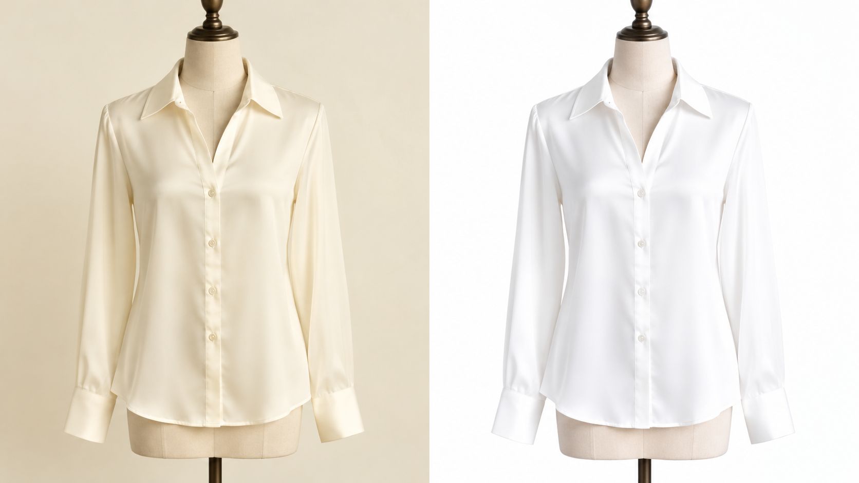
What customers actually notice
Customers rarely say, "the white balance is off." They say the product looked warmer online, cooler in person, or different from the other photos.
apparel color-difference study
That is the same issue, translated into conversion and returns.
The practical rule is simple:
If the customer is buying color, white balance is part of product accuracy.
Large retailers have trained shoppers to expect consistency. Whether the visual style is minimal, editorial, or marketplace-first, the product color still needs to feel intentional and stable. Smaller brands need the same discipline, especially when one item appears on Shopify, Amazon, wholesale sheets, and paid social at the same time.
If you're working through marketplace requirements, this high-converting Amazon images guide is still useful because it frames image quality as a conversion factor, not just a studio preference.
White balance is a workflow decision
This is where most teams either stay efficient or create avoidable cleanup.
On set, speed pushes people toward Auto White Balance. In post, volume pushes people toward syncing edits across a full batch. Both can work. Both can also create drift when nobody sets a proper neutral reference.
The fix is straightforward:
- lock the lighting
- capture a neutral reference
- shoot RAW when color accuracy matters
- batch only when the light stayed truly consistent
- review exceptions frame by frame
This is also where modern production workflows help. If your team needs more output without rebuilding every shoot from scratch, tools like AI product photography can support asset creation and variation while keeping visual consistency under tighter control.
How Color Temperature and White Balance Work Together
Color temperature and white balance are related, but they are not the same thing.
Color temperature describes the light source. White balance is the correction the camera or editor applies to neutralize that cast. One technical explanation also notes that color temperature is based on the blue-to-red light ratio, with green ignored, and it is expressed in Kelvin (technical overview of white balance and Kelvin).
That distinction matters because it changes how you troubleshoot.
If the light is warm and the file looks warm, the camera may not have compensated enough. If the file looks technically neutral but skin looks strange, the correction itself may be wrong for the scene.
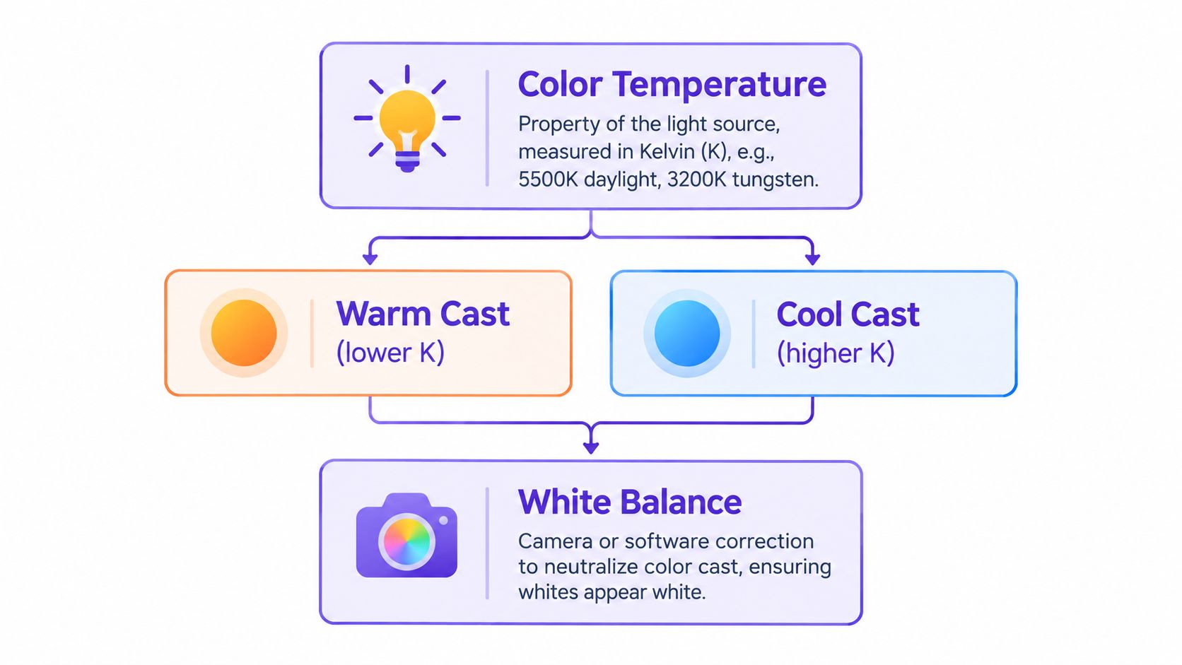
The Kelvin anchors that matter on set
White balance adjustment sits on the Kelvin scale, and the broad ranges are useful to know. Candlelight is typically about 1,000-2,000 K, tungsten bulbs are about 2,500-3,500 K, fluorescent lamps are about 4,000-5,000 K, daylight under a clear sky is about 5,000-6,500 K, and heavily overcast shade can reach about 9,000-10,000 K (Kelvin scale reference for photographic lighting).
Adobe identifies 5,600 K as standard outdoor natural light and 3,200 K for indoor tungsten light, while Canon notes neutral white light around 6,504 K in the same reference range discussed by Cambridge in Colour. Those points are useful because they help you diagnose a set quickly before you start adjusting files (Adobe white balance presets and lighting references).
In practice:
- Warm source, cooler correction: tungsten tends to push garments orange unless you cool it down.
- Cool source, warmer correction: open shade often makes whites go blue unless you add warmth.
- Neutral source, less intervention: daylight-balanced studio lighting is easier to keep consistent.
Why fabrics exaggerate mistakes
Different materials react differently to light and correction.
Cotton is relatively forgiving. Satin, silk, sequins, coated fabrics, and dark knits are not. Black garments often reveal white balance problems first because they shift blue, green, or purple long before someone notices on set. White garments create the opposite problem, because a slight cast immediately changes the perceived product color.
The fastest improvement most teams can make is to stop guessing and start reading the light first. If the setup is drifting between window light, LEDs, and practical bulbs, the white balance will not stay stable no matter how much editing happens later.
For a broader grounding in light quality, direction, and consistency, Picjam's guide to photography lighting basics is worth keeping close to your studio workflow.
The camera records the color of the light hitting the garment, not the color your eye thinks it sees.
Setting White Balance In Camera for Accurate Garment Color
The cheapest place to fix white balance is before capture.
If the garment color matters, the camera needs a reliable reference before the first real frame. That does not mean overcomplicating the set. It means building a repeatable check into the workflow.
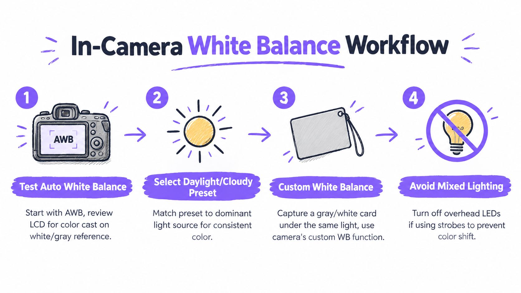
Start with Auto White Balance, then verify it
Modern cameras handle a lot, and Panasonic explains that Auto White Balance recognizes the light source and compensates accordingly. Many cameras also offer presets such as daylight, shade, fluorescent, flash, and manual settings. Practical guidance also notes that many automatic systems adjust between roughly 3,500 K and 8,000 K (Panasonic white balance overview with AWB context).
That is fine for a test. It is not a reason to trust the result blindly.
Use AWB to get moving, then check a neutral target in the same light as the product. Do not judge from the garment alone. A white shirt can look acceptable while gray trim, skin, or background neutrals reveal the cast.
A simple pre-shoot routine works well:
- Shoot one AWB test frame with a gray card in the product light.
- Review neutrals on the LCD or tethered screen for obvious warmth, coolness, green, or magenta bias.
- Switch to preset, Kelvin, or custom white balance if AWB is drifting.
- Repeat the check when the light changes.
This walkthrough is also useful to keep handy during setup reviews:
Use presets when the light is simple
Named presets are efficient when one source clearly dominates. Camera menus commonly include Daylight 5,500 K, Cloudy 6,500 K, Shade 7,500 K, Tungsten 2,850 K, Fluorescent 3,800 K, and Flash, while outdoor natural daylight is commonly cited at 5,600 K and indoor tungsten at 3,200 K (Adobe white balance presets and lighting references).
That gives you a practical starting map:
| Lighting situation | Useful starting point |
|---|---|
| Strobes or daylight-balanced continuous light | Daylight |
| Window light on an overcast day | Cloudy |
| Deep shade near a window or exterior wall | Shade |
| Warm practical bulbs | Tungsten |
| Greenish retail or office overheads | Fluorescent |
Presets save time when the setup is clean. They break quickly when daylight spill, LED fill, and overhead fixtures all influence the same frame.
The gray-card workflow that keeps sets consistent
A gray card, often specified as 18% gray, is still one of the most reliable tools for white balance control. The basic process is straightforward: place the card in the same light as the subject, photograph it, then use that frame to set Custom White Balance or correct neutrals later in post (gray card custom white balance workflow).
This step matters because the reference has to measure the same light the garment is actually receiving.
Put the gray card where the product lives, not off to the side where the light is different.
That means:
- same light direction
- same distance from key sources
- same angle relative to reflectors or window spill
- new reference frame any time the setup materially changes
If your team shoots high volumes of apparel, this one step usually saves more retouching time than any slider adjustment later.
For teams producing model and flat-lay assets at scale, AI fashion photography can also help extend or standardize output once you already have a solid color-controlled base.
If your team shoots clean PDP imagery and wants the background and color treatment to stay consistent, it also helps to align this routine with your standards for white background product photography.
Fixing White Balance After the Shoot in RAW and JPEG
Even disciplined teams get shifts.
Cloud cover changes. A stylist turns on a practical. A reflective shoe bounces color into the frame. That is when post has to cleanly standardize what capture did not lock down.
The big decision is file type. RAW gives you room to correct and unify. JPEG can still be adjusted, but with less flexibility and less tolerance for stronger corrections.
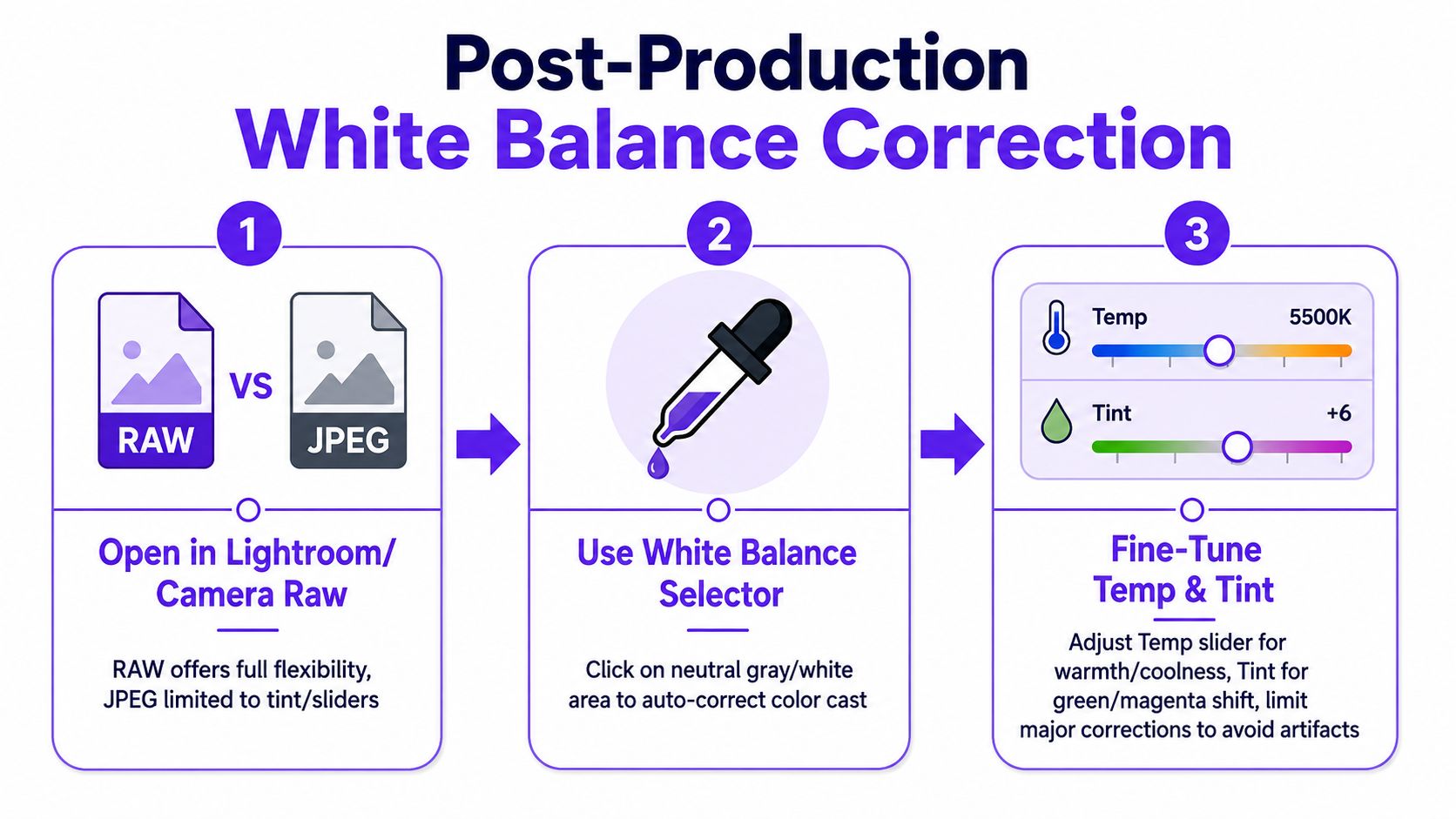
What to correct first in Lightroom or Camera Raw
Most manual white balance controls operate on the Kelvin scale. Lower values make the image look cooler or bluer, while higher values make it look warmer or more orange. Typical manual adjustment ranges are around 2,500 K to 10,000 K, with some camera systems offering 2,500 K to 9,900 K or 2,500 K to 10,000 K depending on model (manual Kelvin adjustment range reference).
In Lightroom or Adobe Camera Raw, a clean workflow looks like this:
- Start with the eyedropper: click a neutral gray reference first.
- Adjust Temperature second: cool the file if whites are going cream, warm it if whites or skin are going blue.
- Use Tint carefully: correct green or magenta bias, especially under mixed artificial light.
- Sync by lighting setup, not by product type: two different garments can share settings if the light stayed the same. Two identical garments may need different settings if they were shot in different conditions.
For fashion work, review correction against three things at once:
- the neutral reference
- the garment itself
- skin, if a model is in frame
If one of those keeps breaking while the others look right, the issue is usually mixed light, not a simple temperature miss.
When RAW matters most
RAW is the better capture choice when color accuracy matters, especially across a rail of products that need to feel consistent as a set.
The practical reason is simple. White balance is far easier to correct cleanly when the file has not already been heavily processed in camera.
That does not mean JPEG is unusable. JPEG is often fine for controlled setups and minor cleanup. But when the cast is strong, or fabric, skin, and background neutrals are pulling in different directions, JPEG reaches its limits faster. Whites can clip oddly. Delicate texture can flatten. Stronger correction can introduce artifacts sooner.
Better white balance correction starts with a neutral reference, not with guesswork.
Batch speed vs frame-by-frame control
Batch editing is where teams either gain real efficiency or create hidden inconsistency.
Use batch syncing when:
- the light stayed locked
- the camera position stayed consistent
- the reference frame still applies
- there were no meaningful changes in ambient spill
Switch to image-by-image correction when:
- the product is reflective
- the model moved through different light zones
- mixed light entered the set
- a practical source was switched on or off
- one angle is reading materially warmer or cooler than the rest
The safest handoff rule is simple: create a reference frame for every setup change so retouching does not depend on someone guessing later.
If your team is balancing in-house edits with outsourced clean-up, keep the white balance reference inside the handoff. For teams refining post workflows, Picjam's article on ecommerce photo editing is a useful companion.
Handling Mixed Lighting, Skin Tones, and Deliberate Mood
Mixed lighting is where white balance becomes a judgment call.
A daylight-balanced key, warm overhead LEDs, and window spill can all hit the same frame. If you neutralize one source, another part of the image can fall apart. That is why so many fashion images look almost right but still feel wrong.
The garment might look passable while skin goes green. Skin might look healthy while ivory fabric turns pink. Neither result is good enough for ecommerce.
The failure points that show up most often
A technical review of automatic white balance for digital still cameras describes a 3-step pipeline made up of white object purification, white point detection, and white point adjustment (automatic white balance review for digital still cameras). In practical production terms, that is a useful reminder that scene cleanup, estimation, and correction are separate steps.
The same review cites a Stanford study showing that transformations applied in XYZ and sharpened RGB were preferred over Bradford and device color space for all subjects, which underlines a broader point: correction quality depends on method, not just on moving a temperature slider.
On set and in post, the common failure modes are familiar:
- False neutrals: a surface looks white but is not truly neutral.
- Mixed illuminants: different color temperatures hit different parts of the product.
- Overcorrection: the product gets neutralized at the expense of skin, or the reverse.
- Blind batch edits: one adjustment gets pushed across frames that were not actually shot in the same light.
How to choose what to neutralize
When multiple light sources are fighting, choose the priority based on the commercial role of the image.
| Scene type | Priority |
|---|---|
| Packshot or detail crop | Garment neutrality |
| Model PDP image | Garment accuracy plus believable skin |
| Editorial banner | Overall mood, with product color guardrails |
For ecommerce, product color usually wins. But not always in the same way.
If a warm practical in the background is part of the intended look, keep it warm. If a cool editorial mood is deliberate, preserve that feeling. The mistake is neutralizing the whole frame so aggressively that you destroy the scene, or letting the mood contaminate the actual product color to the point that the item no longer looks believable.
The better rule is this:
Correct the light that defines the product, then preserve the look where it does not compromise product truth.
That usually means separating the sale-critical area from the atmospheric area. The garment and skin need to feel credible. The lamp, wall tone, or ambient background can keep some warmth or coolness if it supports the image concept.
What to fix on set instead of in post
Some problems are simply cheaper to solve before capture:
- turn off stray overheads when they are not helping
- reposition the subject to avoid conflicting window spill
- gel or match a conflicting source if it must stay active
- re-shoot the gray-card reference whenever the scene changes materially
- check garment and skin side by side on tether before moving on
Recent research also points toward post-capture workflows that support accurate white-balance color-temperature modification in sRGB-rendered images, which is relevant for composites, rendered scenes, and edited ecommerce imagery where correction happens after capture rather than only in camera (post-capture color temperature tuning framework).
Export QA and a White Balance Workflow That Holds Up
Most fashion teams do not need a more complex color pipeline. They need a more disciplined one.
White balance adjustment works when the decision points are clear, the references are captured properly, and the final files are reviewed in context before they go live.
The checks worth putting in place now
Capture a gray-card frame for every lighting setup
Use it for custom white balance on set or neutral correction in post.Batch only when the light really stayed the same
Do not sync blindly across a day of changing conditions.Review product color across image types
Compare hero, detail, alternate angle, and model frames side by side.Check skin and garment together when people are in frame
A technically neutral garment is not enough if skin looks wrong.Protect deliberate warmth or coolness when it serves the image
Keep the mood, but not at the expense of believable product color.
A practical workflow for fashion ecommerce teams
A reliable workflow usually looks like this:
- Capture: test AWB, then lock preset, Kelvin, or custom white balance when needed.
- Reference: photograph a gray card whenever the lighting setup changes.
- File choice: use RAW when color accuracy matters or volume editing is expected.
- Post: correct from the neutral target first, then fine-tune temperature and tint.
- Batching: sync only by actual setup consistency, not by product category.
- Color check: review garments for drift across the full SKU set.
- Export QA: compare hero, detail, and model images together before export.
- Channel rollout: keep one approved treatment across site, ads, and marketplaces.
That last step matters more than most teams think. White balance problems often slip through not because the retouch is bad, but because nobody checks the final set in context. A hero image might be approved on its own while the alternate angles tell a different color story.
Good QA is simple:
- review groups of images, not single files in isolation
- compare against the approved reference frame
- check whites, blacks, neutrals, and brand-signature colors
- make sure exports for each channel still match the approved master
When that discipline is in place, white balance stops being a recurring cleanup problem and becomes a controlled part of production.
If your team is spending too much time correcting inconsistent product color after the shoot, Picjam can help streamline production with fashion-focused image workflows that keep garment realism intact across catalogs and campaigns.

Picjam team
The Picjam team blends AI, product, and creative expertise to eliminate the cost and delay of traditional photography for modern eCommerce brands.